- 2 Min Read / Blog / 3.2.2020

Between CarPlay or Android Auto and technologies that enable new in-car experiences, brands and app makers have opportunities to connect with drivers in entirely new ways. But appreciating the context of driving and addressing customers in the car involves a consideration for what information is most pressing and relevant in the car, and a respect for drivers’ divided attention.
To this end, both Apple’s and Google’s connected car platforms take clarity and immediacy into account, offering developers few tools to display graphical elements on screen and instead prioritizing voice-activated features or spoken notifications. With respect to driver attention, these platforms err on the side of safe and unobtrusive communications. But the ability to control Pandora from a connected car infotainment display is one thing, and truly providing access to smartphone features in car-optimized capacities is more valuable.
How we interface with cars is fundamentally different than how we interface with smartphones—this much goes without saying. Whereas mobile displays have the luxury of our attention for minutes at a time, automotive displays have to factor conciseness and clarity into account in completely new ways. How do these considerations impact the design of connected car apps? According to Punchkick designer Andy Detskas, this comes down to understanding users’ expectations in the car.
“There’s an idea to design products around what people are going to use it for 98% of the time. For example, a Xerox machine is going to do all kinds of things, but people are most commonly going to walk up and copy something. So the process to make copies needs to be obvious, immediate, and efficient.” —Andy Detskas, Designer
But identifying which tasks are most relevant to drivers is no simple feat. As cars and mobile devices become more sophisticated, and as access to once-complex systems becomes easier on the go, users’ expectations about what they can do in the car will evolve. “Cars are becoming entertainment hubs,” said Punchkick iOS developer John Norton, “but that’s just the beginning. New ways of interacting with the content on your phone, as facilitated by the car and future interfaces like voice activation, are going to allow drivers to reclaim portions of their lives. We’ll start to perceive the car as a space to get things done, from triaging emails to listening to podcasts and everything in between.”
But might these complex, multifaceted tasks interfere with the core task of driving? According to Andy Detskas, there are ways to avoid overcomplicating things. “Interacting with the voice is obvious, but there are on-screen things you can do to improve the interface for drivers.” Many of the user interface learnings that apply to mobile apps can inform low-touch in-car experiences, as well. “Practices to keep visual density down, like minimizing the number of fonts or colors in an interface, can help prevent distractions. Minimizing the number of taps to accomplish any task—ideally, no more than two—can help simplify the user flow, and would also help developers narrow the scope of what the in-car app can do.”
Reducing the number of taps involved in any task can simplify user flows, and also help developers narrow the scope of what in-car apps can do.
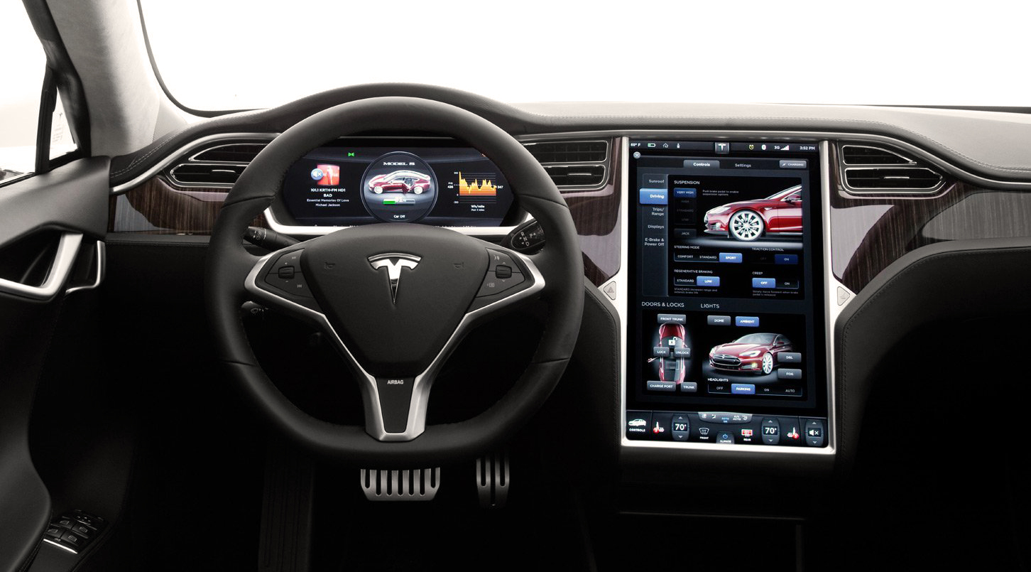
These ideas seem straightforward, and are assisted by recommendations in Apple and Google’s design guidelines, but fly in the face of common interface practices in modern automobiles—even among technology leaders in the space. “Teslas have these massive displays, and that’s definitely going to become the expectation for users,” said Detskas. “But right now, they’re incredibly information-dense. Everything is skeuomorphic, looking like chrome or leather and stuff like that. And it clutters the interface—I was surprised that Tesla would take such an analog approach with its UI, but it reflects that they’re still part of the auto industry’s legacy in that regard.”
With development from both automakers and Silicon Valley giants, a number of user interface approaches are sure to challenge the status quo in coming releases. But the focus on clarity, and minimizing the amount of visual clutter or decoration in the UI, are best practices that extend beyond automotive. “These rules apply everywhere to varying degrees,” continued Detskas, “but they’re intensified in the car and in wearables, where attention is limited and even the occasional glance is a luxury.”