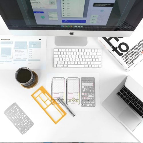
- 2 Min Read / Blog / 3.2.2020

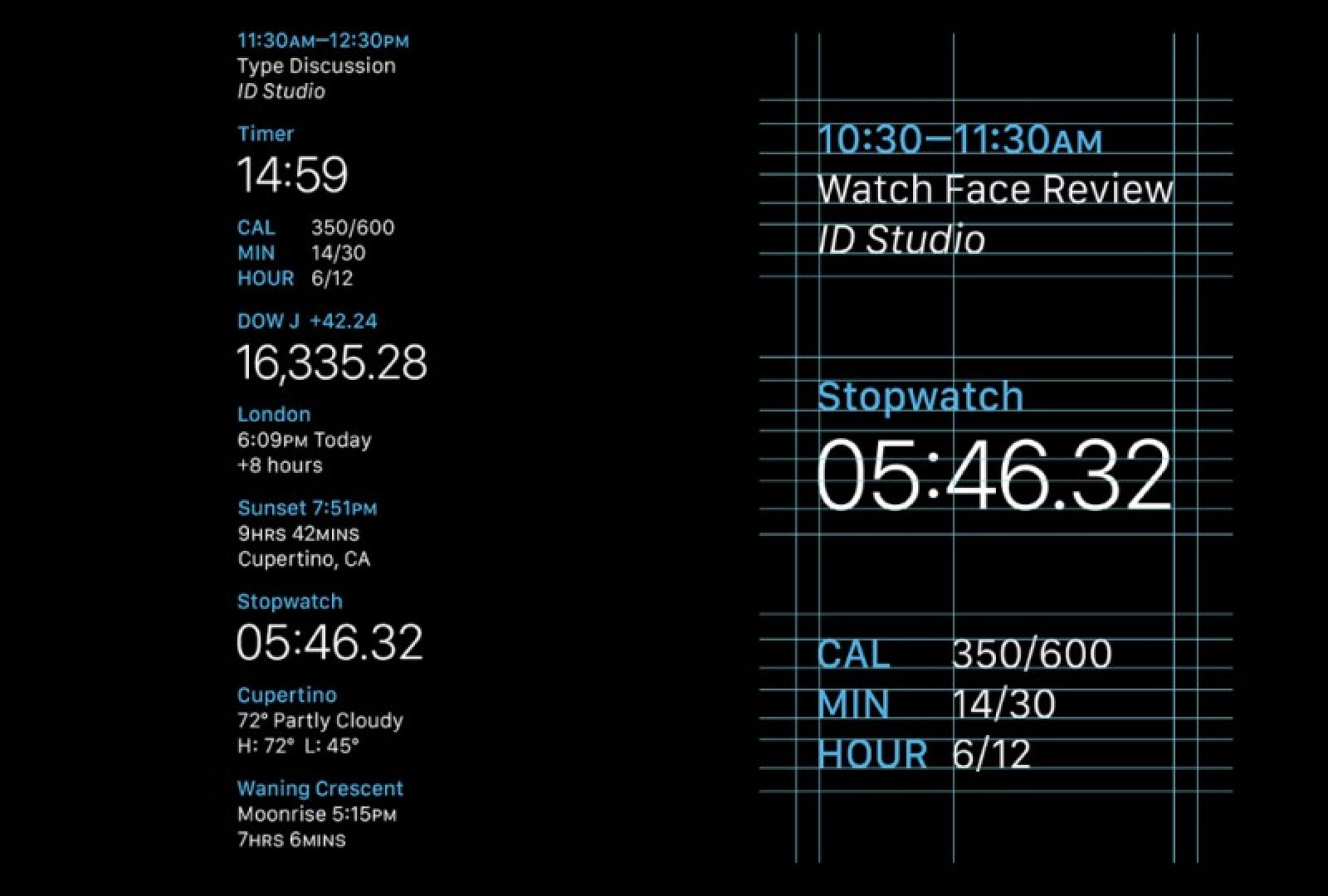


Because the Apple Watch display is so small, and because there are so few items that can be economically displayed within Watch apps, the elements that designers have fine control over become crucially important—like typography. “Typography is extremely important on Apple Watch, even more important than it is on iOS,” said Epstein. “To make apps visually interesting, sometimes there isn’t even room for much of anything else. It’s testing designers’ hierarchy skills to make the most important things come forward.
Apple Watch ships with San Francisco, a font designed by Apple exclusively for the new wearable. The pseudo-condensed, sans-serif font family prioritizes legibility at small scale, with angular corners and tall x-heights. Its name harkens back to system fonts from the original Macintosh in 1984, which were named for major cities and worked within the constraints of the bitmap screen to deliver print-quality typography on the state-of-the-art display. These fonts solved a unique technical problem and empowered visual creativity within technical bounds, and San Francisco follows closely in these footsteps.

Some pioneering Mac users were so taken with San Francisco that they managed to set it as their system font on OS X.
San Francisco is designed to be effective within tight technical constraints—just like Chicago on the original Macintosh before it.
“San Francisco is definitely an appropriate choice for the Watch, and it borrows a ton from typefaces like DIN and Helvetica,” said Epstein. “What’s interesting is that Apple seems to want to use it across a few different form factors, like the Activity app for iOS on iPhone. They seem to be approaching San Francisco like a multipurpose typeface across a variety of media, from print to web to iOS and Watch OS. It’s versatile, but I think it’s going to become very much a part of Apple’s brand identity going forward.” Typography can carry a lot of brand weight, and convey a strong identity for any brand, within the constraints of Watch OS.

While San Francisco may come to define Apple Watch—and by extension, Apple’s larger product ecosystem—that doesn’t necessarily mean that all WatchKit apps need to lean on San Francisco as their exclusive typeface. “San Francisco is the definitive Apple Watch font,” said Epstein. “You kind of have to use it in some places. But Watch apps can also include a secondary, specialized font that more closely resembles the brand, allowing designers to inject a little bit of themselves into the app. Apple warns against using more than one secondary font within the Watch app, but even one instance of Avenir or Gotham or whatever can make an app feel completely unique.”

An example of third-party apps using custom fonts, in Overcast by Marco Arment. Source: marco.org
Font choices are one of Apple Watch’s present limitations when it comes to interface design, but WatchKit doesn’t need to feel constrictive. By making clever choices with color, layout, and interaction design, brand developers and designers can still craft Watch app experiences that feel unique and consistent with their brand identity.