- 2 Min Read / Blog / 3.2.2020


Early last week, Apple launched a beta app for its new music streaming service, Apple Music, for Android. Similar to the company’s 2003 effort to bring its flagship music software, iTunes, to Windows, this is a step forward in bringing more people into the Apple ecosystem. While Apple has a couple apps in the Google Play Store—one that facilitates data transfer to an iOS device, and one that controls the company’s Beats Pill+ speaker—this is Apple’s first dive into bringing a real app to the Play Store. Apple has done a fairly impressive job for the massive size of the application, but despite its respectful intentions, Apple’s approach to Android development isn’t without its missteps.
The unthinkable has happened: Apple has finally developed an Android app.
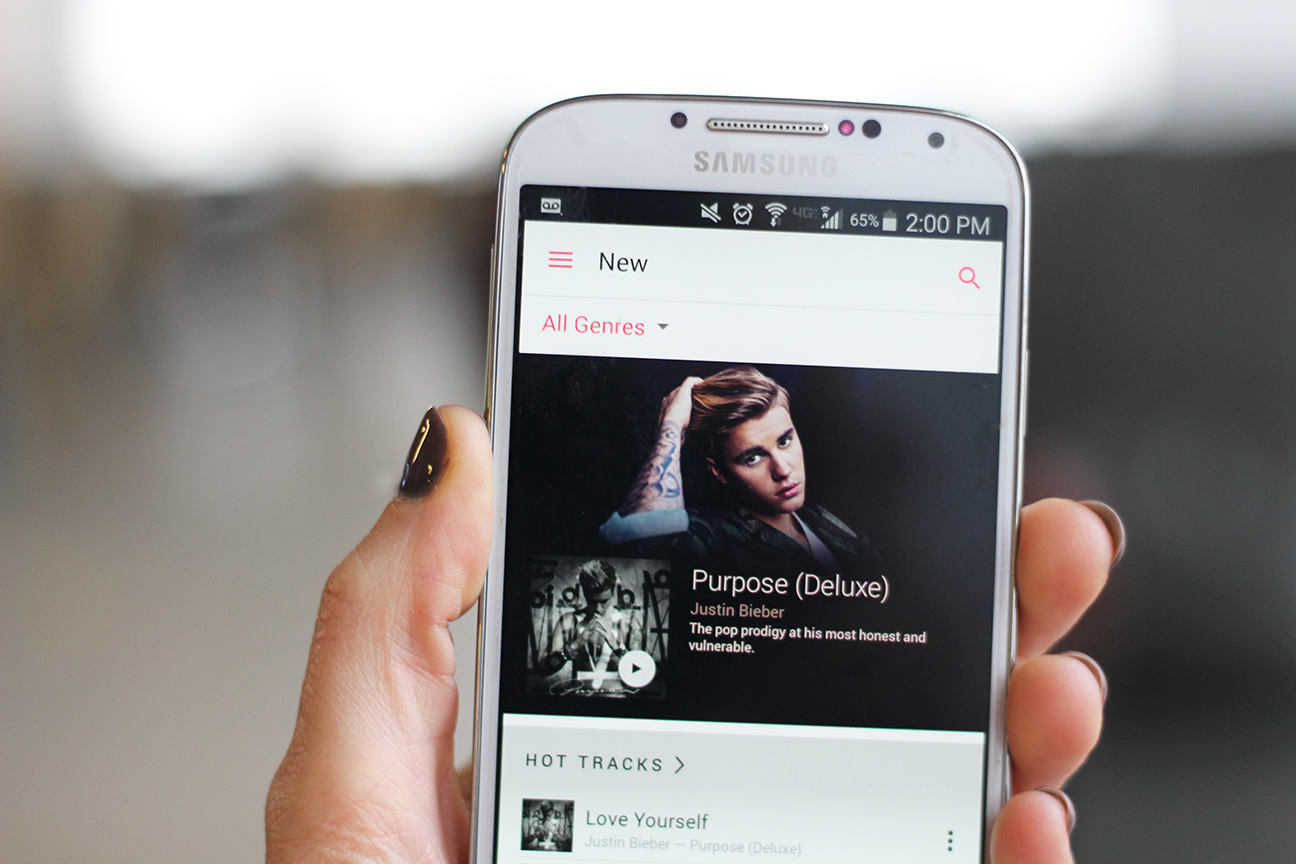
The app itself looks very similar to the iOS version, with the addition of Material Design components, such as a navigation drawer (which mostly mirrors options present in the toolbar on the bottom of the screen in iOS), pull to refresh, and snackbars (which Material Design recommends for brief messages at the bottom of the screen) instead of pop-up toast messages. It seems Apple has put a fair amount of design effort into creating a happy medium between iOS design and Material Design, helping to make Android users comfortable using the app.
However, just as we’ve seen in the iOS version, navigation does not appear to be a strong suit for Apple Music. With its depth of menus and abundance of different ways to view the same content, navigating the app can be a confusing experience—it’s very easy to get lost in the app. Poor design of in-context navigation—which combines the navigation drawer with the ability to bring up another view with its own navigation when the user selects something else on screen—leads to issues with having a very large back stack of screens the user must back out of. Because the navigation drawer isn’t available in these context screens, the only options for navigation are to either use the back arrow or click on something else on the screen, which pulls up yet another screen on top of the screen already there. In our initial experience with this app, we unknowingly created a back stack of over 20 screens that we needed to back out of, which was a less than amazing user experience.
Navigation doesn’t appear to be a strong suit for Apple Music.
Besides the effort put into meshing iOS and Android design, Apple Music has presented itself with some nice features to draw users in. Just as in the iOS app, the onboarding process it uses to gauge the user’s taste in music genres and artists is fun and interactive, asking the user to tap vibrant bubbles of items they like, which then inflate based on how much they like it, or hold down to dismiss an item they dislike altogether. The range of artists and songs available, along with type of radio stations to listen to, is very large, making it hard for even users coming from Spotify or Google Play Music to be disappointed with what’s available. In addition, the app’s customized recommendations are far better and more personalized than expected.
Since the app is still in beta, there are plenty of bugs present, and some features, such as music videos, are not yet available. Apple Music on Android also offers few outstanding or novel features for its $9.99 per month subscription price, which may be a high barrier to entry to convert users from other streaming music services, many of which offer a similar experience and feature set for the same price. As Apple’s first real attempt at entering the Android market, however, Apple Music translated nicely from its initial iOS design and provides an impressive, full featured music streaming app that has potential to gain a promising user base in a previously unexpected market.