- 2 Min Read / Blog / 3.2.2020


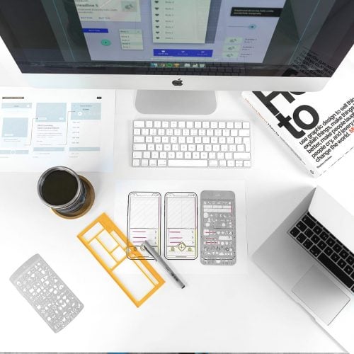
Here at Punchkick, we subscribe to a mobile product development approach that emphasizes the fact that we are not our users. With respect to that approach, our design and development process is immensely iterative. For Punchkickers, the goal of giving actual end users what they actually want involves a great deal of hypothesis testing, thereby creating a successful minimum viable product (MVP) that truly comes from the intersection of art and science. Through the course of product iteration the designs we begin with often look drastically different than the final product, which is exactly what we’re hoping for. Although the Punchkick team makes decisions grounded in best practices research, and of course a bit of their own creative magic, effective and impactful design and development is not about giving end users what we think is best for them but, in contrast, providing those users the opportunity to act as active contributors in the creative process.
Effective product design is not about giving users what we think is best for them, but instead inviting users to participate in the design process themselves.
Part of the user testing script that we have developed involves making it clear to participants that we want them to be critical. Our research team encourages prototype testers not to be afraid that they’ll hurt our feelings if they really hate one of the designs that we put in front of them. Consequently, testing MVP iterations also involves disconnecting from our own emotional attachment to any given design. Sometimes it’s painful, but understanding what users hate is just as useful as understanding what users love. Sure, when participants despised the hamburger menu that was stylized to look like an actual hamburger we may have shed a few discreet tears behind the two-way observation mirror in our research lab, but Punchkick has one goal: make something delightfully beneficial for the individuals who will be using it.
Based upon this research perspective, it should be clear that Punchkick has bought into the value of UX research, and embraced the necessity of making design and development decisions rooted in data gathered through user testing. In spite of the positive impact that UX research has on an MVP’s overall quality and return on investment, it can sometimes prove difficult for stakeholders at many organizations to see the value for themselves. We set out to debunk some of the most common arguments against UX research in the hopes of coaxing non-believers out of the dark and into the welcoming glow of actionable insights. The following list is by all means not exhaustive, but it does include some of the most commonly discussed arguments from the industry as well as some examples from our own experience.
Although many a UX researcher would love to live in a world of unbounded wireframe and prototype testing, mobile product developers need to acknowledge the budgetary and timeline constraints of every project if they ever hope to sell their services to prospective clients.
Identifying, sourcing, scheduling, and executing UX research sessions can admittedly be time-consuming, but not nearly as time-consuming as launching a digital product, watching it fail, and then going back to the drawing board (if you’re even given that chance). Not to mention the detrimental impact that a poor digital experience can have on customers’ brand perceptions. In actuality, investing in UX research is, “the right way to launch better, faster, and with the least amount of wasted resources. Analytics alone aren’t actionable; but once you see the human experience behind the data, you can determine precisely where to spend your resources.”
So at this point, what was once classified as a waste of time and money has now become an investment in positive brand perceptions and a guiding light to precise resource allocation. But the transformation from squandered resources to wise investment is far from well-spun words from a silver-tongued salesperson. As Jess Hutton, usability specialist and staff writer for UX Booth, explains, “When it comes down to it, ‘wasted resources’ is only a good objection if the team has no intention of fixing the issues that come up in testing. And if the team isn’t interested in improving the product, then there are bigger problems at hand.”
Concerns about the standard 5–10 participant sample size used in each round of usability testing commonly stem from confusion about the intents and purposes of specific research methodologies. Most of this confusion is a result of inaccurate comparisons between market research and usability research. Market research, which employs quantitative research methods, is typically interested in factual and preferential trends, often requiring hundreds of respondents to achieve statistically significant findings. On the other hand, usability research employs qualitative research methods, focusing primarily on observing behavioral trends that result in usability pain points and building an understanding of why those behavioral trends occur. More times than not, patterns of behaviorally driven usability issues begin to emerge in as few as three user testing sessions.
But you don’t have to take our word for it—Jakob Nielsen (often considered the godfather of UX research) has noted that, “The vast majority of your user research should be qualitative—that is, aimed at collecting insights to drive your design, not numbers to impress people in PowerPoint.” In other words, once key design problems are expressed by somewhere between 3–5 users, it’s time to begin the next round of iteration. There is no need to hear 100 user testing participants complain about their inability to locate an important call to action—product designers should provide those users with an adequate solution and move on to identifying the next issue.
As it turns out, behavior is actually relatively consistent from person to person. Author, consultant, and UX guru David Travis, Ph.D., gives the example that, “if you watch 5 people approach a door, and 4 of them attempt to pull it when the door needs to be pushed, you know there’s something wrong with the design. You don’t need to randomly sample 370 people to draw this conclusion. You observe that the door has a pull handle, and it’s probably that that’s causing the problem. So you replace the pull handle with a push panel, and see if you’ve fixed the problem.”
Because UX researchers are looking for similarly simple behavioral trends, we can get decision driving data from a 5–7 participant sample, use that data to make the necessary changes, and then move on to identifying the next round of user pain points.
When it comes to designing and developing digital products, it is critically important to design for a specific audience. When stakeholders say things like, “Our MVP will be aimed at everyone, so there’s no need to recruit for any specific kind of users,” it’s almost always a red flag. Although everyone can use any given digital product that doesn’t necessarily mean everyone will. The argument in favor of product audience specificity goes back to the old saying, “jack of all trades, but master of none.” As Jess Hutton has said, “The downside of a product with ‘something for everyone’ is that it has ‘everything for no one.’” Designing and developing a product focused on a specific group of users will more often lead to success, even if the product will eventually be used by a more diverse set of end users.
A product that’s designed to be “one-size-fits-all” will effectively become “one-size-fits-none.”
Geoffrey Moore’s nearly two-decade-old marketing book Crossing the Chasm provides some of the most compelling evidence in the argument toward focusing on specific audience segments when building and launching a digital product. Moore argues that, in order to avoid high early adoption numbers followed by drastic abandonment (what he calls the “chasm”), tech products should first be a total solution that solves a specific problem for a specific audience.
The second part of this misconception about UX research—that actionable MVP iteration insights can be gathered by receiving feedback from other organization employees—is equally inaccurate. First, real-life end users will likely be less technologically inclined, certainly less informed about the goals of the product, and, most importantly, less accepting of small shortcoming than internal contributors. Moreover, it’s extremely rare that internal team members will ever represent the target audience for the MVP that is being created.
A pertinent example of the importance of observing actual end users interacting with a given interface comes from research that was performed in the early 1960s on the control panel interface used by fighter jet pilots. In this example, pilots were continually crash landing their planes as a result of what was thought to be some kind of mechanical error. Internal engineers could not identify any mechanical malfunction, so a research team was commissioned in the hopes of identifying the cause of the crash landings. Only once actual pilots were observed interacting with the plane’s interface were the researchers able to identify why the crash landings were occurring. As it turns out, there was no mechanical issue with the plane or any of the controls: the issue had to do with user error as a result of control placement on the plane’s user interface.
Researchers realized that the switch used to deploy the plane’s landing gear was situated in close proximity to the switch used to fold landing gear back into the body of the plane after take off. The pilots, who were primarily focused on looking at their surroundings when preparing for landing, were flipping the switch used to disengage landing gear rather than the switch used to deploy the landing gear. The solution was simply to separate the two switches, which resulted in an extreme reduction in crash landings for this particular plane. From a logical standpoint, situating switches that perform similar functions in close proximity to one another makes intuitive sense, but from an actual real-world usage standpoint, the close proximity of these switches was the direct cause of costly user error. Overall, even the most well–thought-out and seemingly logical solutions can be ineffective. The only way to make absolutely certain that the most user-centric decisions are being made is to allow those users to directly inform those decisions for themselves through testing and observation.
* * *
User experience research isn’t about finding out whether or not users want a given button to be red or blue. And it’s not about tasking random users to do your design work for you. In contrast, UX research is about observing where the most well-considered designs fall short of meeting user expectations or inhibit the performance of necessary tasks. It’s about seeing where designs unintentionally create challenges rather than solutions for users, and then using those observations to iterate products into their most effective versions.
It’s part of CEOs’ and product owners’ jobs to be solution-oriented. These important stakeholders often have tunnel vision in terms of making build and feature decisions based solely on desired ROI—how can we spend the least resources and make the most money? An unforeseen consequence of this kind of tunnel vision is that these individuals at times lose sight of the long view of the project. UX researchers are often tasked to play the role of reminding CEOs and product owners that spending a bit more time and money upfront will save a substantial amount of time and money in the long term. Projects without UX more often than not end in failure because no one has considered how things will actually work when the X-factor of human-ness is added into the mix.
Sadly, this is the reality of MVP development for many agencies, and why there are so many horrifically unusable apps and websites out there. UX research tames the urges of companies to build feature-bloated solutions that fail to facilitate even simple tasks for the user. While providing a delightful user experience does not guarantee a product’s overwhelming success, and might go unnoticed by most end users, a poor UX is extremely noticeable and in most cases precipitates product failure.
Every MVP ever created has a user, but not every MVP is created with a focus on that user. Sometimes it’s because deadlines or resources don’t allow for this kind of consideration, and sometimes it’s because designers aren’t given enough specific information about their end users’ behaviors and needs. As contributors to the creation of digital products, one thing that must never be forgotten is that users are the ones who utilize our products long after the project has ended and we’ve moved on to building something else—and that is precisely why users need to be a part of the process of creating these products in the first place.