

- 2 Min Read / Blog / 3.2.2020


In recent years, Google has put an increased emphasis on the design and consistency of its products’ web and mobile interfaces. At this year’s I/O developer conference, the company announced its latest design initiative for the web and Android, which it dubbed “Material Design.” We sat down with Andy Detskas, an interactive designer at Punchkick, and talked about what these new design guidelines mean for consumer brands and their Android apps.
“Google has had to learn design in its own way.”
Google is the epitome of a data company, so its early design decisions were informed by that focus. “They used to redesign products based on analytics,” said Detskas, “they would test a color and see what would stick.” Since hiring Douglas Bowman as Visual Design Lead in 2006, Google has worked to transform its image into an interface design powerhouse. “That was the first sign of Google starting to get it. They’ve brought more and more humanity to their designs over the years.”
In May 2010, Google hired former Palm designer Matías Duarte to lead its Android user experience team. At the mandate of the company’s new CEO Larry Page, Google undertook a sweeping redesign of all its core services and applications, an initiative codenamed Project Kennedy. In subsequent years, Google revisited the design of products like Search, Gmail, and YouTube in the interest of continuity and useability. But we learned at this year’s Google I/O that the company wasn’t stopping there.

Duarte introduced the future of Google’s design guidelines with a 48-second video and a precious few minutes of explanation before the keynote presentation rushed forward into Android news. But his announcement was far more significant for both Android and web than its hasty introduction suggests.
“Material Design changes everything. It signifies the arrival of super high-quality design on the Android platform. Not that things were bad before, but now we can say that they’ve arrived. They’ve been working towards this point ever since they acquired Android.”
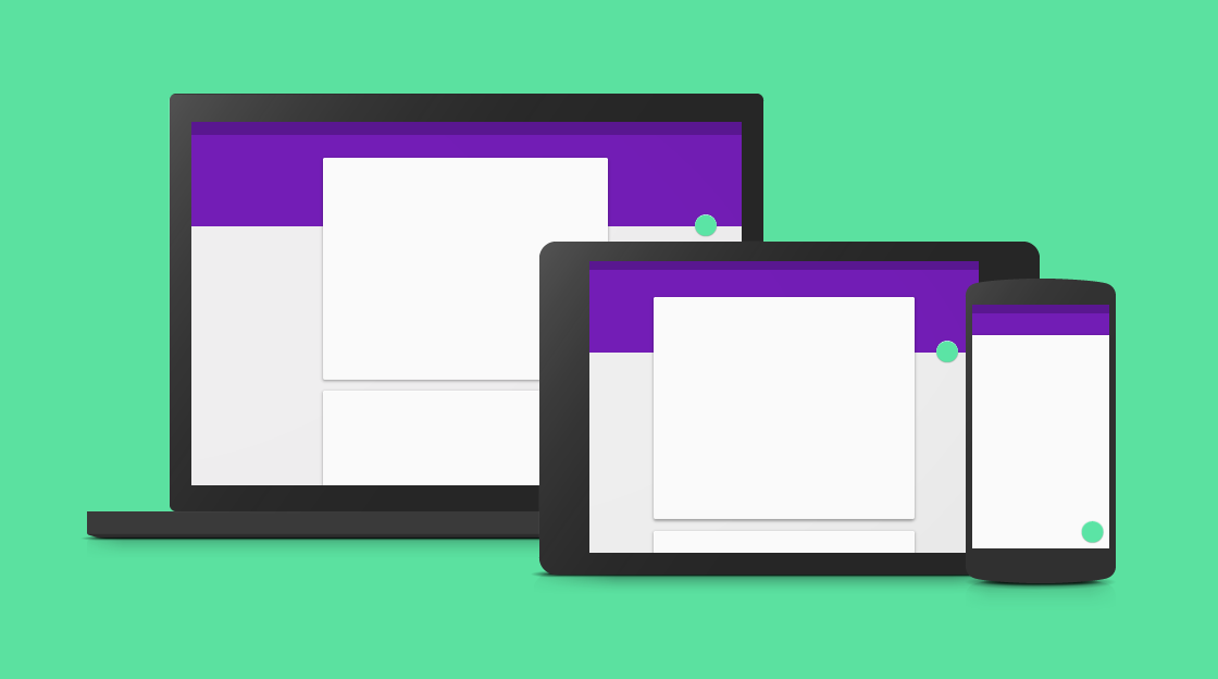
Material Design is a set of best practices and guidelines for user interface design within the Android and Chrome ecosystems. The style guide that Google deems a “unifying theory of a rationalized space and a system of motion” provides interface designers with templates and building blocks for consistent interface elements and animations.
Apple has long maintained guidelines of similar intent and scope, called the Human Interface Guidelines (affectionately called the HIG within the design community). Available in Apple’s developer portal and as a free download from the iBookstore, the HIG gives iOS designers access to Apple’s thinking on mobile user interface design. “We now have a HIG for Android,” said Detskas. “Clear, coherent, deep design guidelines exist for Android now. Designers have a starting point, and if you’re a designer who hasn’t worked on Android before, you have something to fall back on.”
“Clear, coherent, deep design guidelines exist on Android now. They’ve arrived at something that’s pretty amazing.”
Google published an immense 48-page manual on its new design portal that outlines the thinking behind its system and the principles that support it. The guide includes suggestions for the structure and behavior of buttons, menus, and even notification bubbles Google calls snackbars and toasts. Not limited to Android phones and tablets, the Material Design guidelines address interfaces across the growing ecosystem of “Android” branded devices, including Android Wear smartwatches and televisions running Android TV. “I think that in some ways, Material Design is even better than the HIG because it makes the experience of working in Android native. It answers a lot of questions about how things will behave, and gives designers something to grab onto.”

One of the larger implications of Google’s Material Design release is that its guidelines apply to more than Android or even mobile apps. Its guidebook includes tricks that Andy Detskas calls so “elemental” that they can not only be applied across mobile platforms but also across the web.
Material Design is intended to be adaptable to screens of any size and dimension, with concrete examples and instructions for mobile phones, tablets, Chrome OS devices, Android Wear devices, and web pages. This will allow brands and developers to provide one consistent and elegant experience across all devices and experiences, an aim that many companies have recently focused on delivering. For Google, investing in web interface design serves not only its own web products, but also makes it easier for designers to build seamless interface experiences between mobile and web for their own products.
While the Material Design documentation provides thorough guidance and introduces the overarching principles of Google’s interface design direction, its Polymer framework provides the brass tacks of building the web interfaces themselves. Introduced at last year’s Google I/O, Polymer builds on Web Components to “make it faster and easier than ever before to build beautiful applications on the web.”
While Polymer itself doesn’t include or enforce Material Design techniques, the quickest way for a designer get a project up and running is to take advantage of Google’s assets. Like other web frameworks, including Twitter’s popular Bootstrap, Polymer gives designers new tools that they can use to “get a running start on projects,” says Detskas. Google has invested in assets that enable designers and developers to create fluid, responsive, and beautiful experiences for the web—but also and especially for Android, Android Wear, and Chrome OS.

“With all guidelines, there’s a possibility of taking them so literally that you don’t make something new.”
Material Design aspires to provide for a uniform system of depth and motion, and each of Google’s mobile apps is expected to adopt this style alongside the release of Android L in coming months. But to what degree will third-party apps be able to differentiate themselves from the uniformity? Google suggests image treatments, fonts, and even a palette of colors as parts of its Material Design guidelines, so an overly strict interpretation might preclude certain brands’ apps from any sort of individuality.
Andy Detskas feels differently. “Material Design gives you an ample starting point, assuming your app is going to look and work like a native app. But how brands adopt it remains to be seen.” Because the scope of Google’s Material Design guidelines are broad enough to include the structure and behavior every piece of an app’s user interface, they might suggest that every third-party app would begin to feel rather vanilla. But according to Detskas, there’s enough flexibility within the system to allow an app’s brand to shine through. “Some of the animations and behaviors it describes are so elemental, they aren’t ‘owned’ by any one brand,” he says. “It’s not like it prescribes anything that prevents you from having a unique brand voice.”
“Material Design is appropriately named, because it’s not called ‘Android Guidelines.’ It’s material guidelines. Google is providing you with subtle user interface cues that you can choose to tap into, like color usage and animations. It does give you colors to work with, and guidance on how those colors work best in the foreground or the background—basic ‘Design 101’ stuff that you can insert your brand into.”
So why should a consumer brand app consider a Material redesign? Detskas believes it comes down to user trust. “Material Design, because of how consistent and solid it is at this point, could engender user confidence in the security and stability of the platform. How much trust does Android have in the bank at this point? And will this new level of polish inspire trust?” By implementing Material Design in their own apps, brands could tap into the renewed level of confidence that Android L will begin to build.
“If I download a Chase app onto my Android phone, and it references some of the nicer aspects of the platform, like the animations and the subtle cues for depth, it helps me feel like it belongs on my phone. The polish helps me trust it. So if a solid design engenders trust, it’s in a company’s best interest to leverage those guidelines wherever they don’t conflict with their brand.”
Just as Google begins expanding its Android product family to encompass wearables and the living room, Material Design delivers a degree of consistency and vision that the platform has been lacking. “They’ve released provisions that allow you to build an app that has a very native Android experience that’s still in line with your brand,” concluded Detskas. Whereas iOS has historically been a designer showcase for new and innovative interfaces long before coming to Android, all of that may begin to change as Google and its partners begin to build out this new system and the suite of tools that make it easier to build interfaces. As for designers who are more accustomed to Apple’s HIG? “I think every designer should carry an Android sidearm.”