
- 2 Min Read / Blog / 3.2.2020


Even before its release in 2008, Android’s only constant has been reinvention. What began as a basic operating system for feature phones has exploded into the top mobile platform on the planet, with the industry’s largest touch screens and most extreme hardware capabilities. Android became a diverse and robust ecosystem of smartphones and tablets, with custom designs and features for each distinct manufacturer. The core of Android remained strong, but its influence was waning: as Google iterated its platform with new features and versions, carriers and OEM partners were sloth to adopt. When Google looked to expand Android onto types of devices—like wearables, televisions, and cars—it came time to pull the reins harder.
Android Lollipop represents Google asserting control of its platform, and its intention to bring its singular vision for Android to every connected device in your life. Welcome to Android everywhere.

Android’s newest incarnation, version 5.0 Lollipop, comes at the end of Google’s stutter-step legacy of subtle refinement and dramatic reinvention. Through its 10 dessert-themed updates, Google has expanded the platform’s scope from a Linux-based feature phone OS to a sprawling ecosystem of connected smartphones, tablets, and wearables. But each move Google has made to perfect its vision for mobile has come at the cost of numerous concessions and compromises with the manufacturers and carrier partners that delivered Android to the world. For users, this meant a wide variety of divergent Android experiences across myriad form factors and designs. For Google, and for developers, these allowances began to introduce problems of version fragmentation and inconsistency. In order to reach a user base of more than one billion, Google needed strong partnerships and design collaboration with more established mobile brands. But now that Android has conquered the smartphone industry and established itself as the world’s most popular mobile platform, Google is poised to take control back.
Google’s approach to wresting tighter control of Android has been two-fold. First, it sought to recapture the attention of the millions of Android users whose devices might never be updated to the latest version. Thanks to innovative upgrade strategies through Google Play Services, even devices running years-older versions of Android could receive access to the latest APIs and run the newest versions of Google’s many Android apps and services. Effectively, Google was able to circumvent the complicated carrier update processes, which required in-depth code reviews that often delayed or prevented version updates as manufacturers worked to make their custom interfaces compatible with the new versions. But while Google Play Services and compartmentalized app updates addressed the millions of people running previous versions of Android, Google also needed a compelling reason for customers to consider a more vanilla Android experience. It had tried to solve for fragmentation with technology, and had found a relative degree of success. Now, Google needed to develop a modern Android experience that could win customers’ hearts and minds.

With Android Lollipop, Google introduced a radically new design philosophy that would guide its interface decisions across platforms and products. Material Design introduced a bright and inviting architecture for user interfaces, and begins on Lollipop as a refresh for system apps like Settings and the Dialer. But Material Design factors larger into Google’s product strategy than a retooled visual design for some apps: as Google iterates its services and filters redesigned interfaces backwards through versions via Google Play Services, the company is creating a compelling incentive for customers to explore Material Design–compliant mobile experiences, even on newer devices. This, in theory, would encourage customers to gravitate toward more “stock” Android experiences like Motorola or the Nexus series—devices that not only adopt Lollipop’s many interface changes, but that also promise to be first in line to be upgraded to what’s next.
Lollipop already runs on a handful of Android devices from LG and Motorola, and is available first via an over-the-air update to Nexus products. Motorola’s proximity to Google’s intentions—result of both its temporary status as a “Google company” and of its devices’ interface similarity to vanilla Android—accounts for its upgrade aggression. But a growing number of Android fans have begun demanding future-proof and Android-compliant devices that take advantage of the platform’s most cutting-edge features. Google has spurred on this interest with its Nexus lineup, a longstanding series of smartphones and tablets that showcase Android’s sharpest capabilities and are guaranteed to be updated when Google releases something new. But in order to persuade customers to invest in the Nexus ecosystem, or to pony up premium dollars for the vanilla Android “Google Play Editions” of manufacturers’ flagship handsets, Google needs to make version updates not only useful and practical, but also exciting.
Lollipop represents the company’s latest effort to mainstream the core Android experience and encourage OEM partners to tread close to the prescribed route. Motorola, as one example, has modernized its Android strategy on the Moto X to tweak very few interface elements and instead add valuable consumer features exclusive to its product family. While Samsung and others have traditionally modified the Android interface and included numerous features above and beyond Google’s baseline, the changes to Google’s and many third-party brands’ apps with Material Design might encourage its designers to fall more closely in line. Lollipop is the beginning of standardization on the Android platform, an initiative designed to highlight the best that Android has to offer and to curtail the frustrations of interface and version diversity. Google is taking command of the Android experience, starting with a design statement on the platform’s most important property. With Android 4.4 KitKat last fall, Google sought to make the latest version of Android as widely available as possible. With KitKat, more phones than ever could get up to speed. Now, with the design and feature additions in Lollipop, more customers than ever will want to.

Lollipop’s feature additions are targeted at enhancing the user experience in both subtle and dramatic ways. Many reimagine core components of the Android interface to comply with Material Design standards, but all of the changes are clearly focused on giving users quicker and more seamless access to common tasks and streamlining common processes.
Android once cornered the market on notification triage, managing the deluge of messages and alerts that can overwhelm smartphone users with a convenient slide-down menu and actions to dismiss or take action on individual notifications. Whereas iOS users until version 5 were buried under frustrating modals and interruptive popovers, Android learned early that messages and notifications would only become more common as smartphone platforms matured. While Apple caught up to Android with Notification Center and actionable notifications in future version updates, Android made few changes to its notification system over subsequent years, leaving a few gaps in the user flow and introducing minor frustrations for power users.

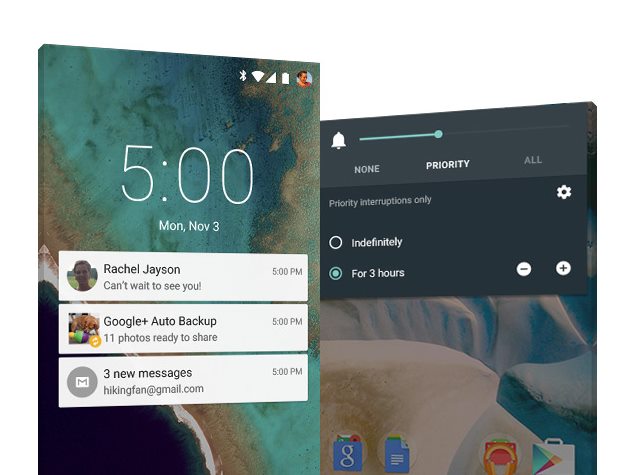
With Lollipop, Google revisited the notification interaction design in major new ways. One massive addition is the inclusion of interactive lock screen notifications, which corrected a longstanding pain point for many Android customers. Previously, new text messages and emails received while the device was locked would simply add an icon to the status bar, and would provide little glance-friendly information as to the notification’s content until users pulled down the notification panel. In Lollipop, a robust new notifications system allows for one-touch triage and quick actions directly from the lock screen, matching and exceeding capabilities included in iOS. Mirroring the quick interactivity of notifications on Android Wear, the platform’s wearable derivation, users can now quickly dismiss or take action on their various notifications right from the lock screen, without prompting the notifications panel or opening an app.
But the notification additions aren’t limited to the lock screen. The delivery and behavior of notifications were rethought throughout the operating system in the interest of better clarity and accessibility. Now, high-priority notifications like user-defined alarms and incoming phone calls appear in an animated material banner at the top of the screen rather than a screen-takeover modal that demanded immediate action. Messages and emails, which once delivered a subtle (and easily ignorable) line of text in the status bar, now leverage the same material banners to attract quick glances without taking attention away from tasks at hand.
Source: NDTV
But Lollipop also provides greater control and contextual customization for customizations for any app. New settings for “interruptions” help users define when and where they’d like to be notified of different messages, and allow for a greater degree of control and privacy over the operating system’s behavior. A new Priority Mode option lets Android users disable distracting notifications for a set time duration or from certain sources. The functionality is great for movie theaters and meetings, or for when Android devices begin to run low on battery power, and matches behaviors like Do Not Disturb in iOS. What’s more, new app-specific notifications preferences in the system Settings allow users to define priority and sensitivity assignments, determining when and where notifications are delivered or visible. (For example, work emails might always come through because of their priority settings, but messages from a dating app might not be visible to the world on the lock screen for increased privacy.) Refining the behaviors of notifications are one subtle user experience tweak Google included with Lollipop, but underscore its commitment to streamlining and perfecting every aspect of the operating system with this new version.

For years, Android has been built around three basic ever-present buttons at the bottom of every screen: a backward arrow that takes users back to the previous screen, a central button that returns users to the app launcher, and a third button that showed running apps and processes. In Lollipop, these buttons got a Material Design makeover, becoming triangles, circles, and squares reminiscent of a PlayStation controller. But the interface wasn’t all that Google refreshed: in this new version, the company rethought how multitasking could behave on mobile.
Android was one of the first mobile operating systems to include multitasking functionality, leveraging manufacturers’ powerful hardware components to allow parallel processes and concurrent apps. Building upon the card-based webOS that Android design head Matías Duarte developed for Palm, Google introduced a card-based task overview that showed running apps and allowed users to effectively end or dismiss processes with a swipe. The feature delighted power users who wanted greater control of their phones and could manage several processes in tandem, but introduced a confusing degree of complexity for novices. Which apps are running? Which are draining the battery? Which apps should be swept away, and which are permissible to leave running?
In iOS 4, Apple took a stab at multitasking on the iPhone, and introduced a slide-up overview shelf that allowed users to view recently used apps and dismiss them if necessary. Rather than allowing apps to constantly run, draining battery and eating up processor cycles, Apple’s approach instead saved app states and screens for users to resume at some future point. (Certain app types, like audio streamers and navigation apps, were allowed to truly remain running in the background.) But users were still confused by the interface design: even experienced iPhone customers would routinely double-tap their home buttons to “quit” these apps and dismiss them from the shelf, fearing the battery drain and processor slowdown that might result. Neither company had clarified the true nature of multitasking on their platforms, and Android needed a new solution that matched Material Design’s simplicity and elegance.
Source: Droid Life
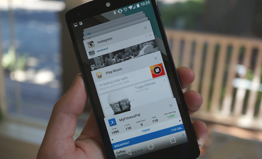
Google’s solution not only simplified the task management process on Android, but also introduced new functionality and clarity around how apps and processes behave and interact. Dubbed “Overview,” the new multitasking interface incorporated a Material Design–inspired scrolling stack of cards for each open application. The interface leans on apps’ most prominent color to inform a title bar for each card, becoming a beautiful scrolling rolodex of colorful application processes. Users can simply and easily swipe away unnecessary app screens when they become irrelevant, and can universally access the Overview mode from anywhere, system-wide, using the squarish Overview button in Lollipop.
But Overview doesn’t stop at a basic re-skinning of the Android multitasking interface. Android Lollipop introduces a new functionality for document-based applications that allows them to submit multiple cards into the Overview mode. Now, the Chrome web browser can appear with distinct Overview cards for each of its open tabs, and documents in Google Docs or drafted messages in Gmail can each live in Overview alongside their host application views. The introduction of more than one card for compatible apps will help users better understand the various tasks their Android devices are simultaneously managing, and will allow battery- or power-conscious users increased flexibility and control over their devices’ performance.

One of the most harrowing processes for mobile customers, even seven years into the category’s maturity, is transitioning between devices. Apple products long leant on iTunes backups and restores to transfer data and preferences between iPhones, and have since switched to iCloud backups as an optional wireless workaround. Google offers a backup service for Android products, as well, but the restoration process often necessitated additional app downloads and preference reconfiguration after the fact. With Lollipop, Google is leveraging Android device hardware to streamline and simplify the process of purchasing and transitioning to a new Android device.
A new process called Tap and Go allows Android customers to quickly and easily initiate the transfer and restore process between two Android devices. While users can still restore data from the cloud using their Google accounts, Tap and Go enables device-to-device transfer of installed applications and preferences immediately during setup. After pairing the two Android phones via NFC, the old device informs the target device of installed apps to download from the Google Play Store and of interface preferences like app layout and wallpaper selection. The addition promises to make the initial configuration and setup processes for Android products simpler and more efficient, and Google services’ deep reliance on the cloud for user data will assist in the restoration of photos and messages after setup is complete.

Source: Android Central
But Lollipop doesn’t stop there. In tune with Google’s intent to take command of its platform and remove dependencies on carrier partners, the new version of Android ships with a feature called Play Auto Installs that directly addresses the matter of preinstalled carrier software. Whereas Android customers have historically been frustrated with some of the preinstalled software decisions from their selected carrier, which are effectively built into some Android devices and impossible to uninstall, Play Auto Installs formalizes the installation process for carrier-specified apps and gives users greater control.
With Play Auto Installs, Lollipop devices identify during setup whether a carrier SIM card is installed, and immediately begins downloading the carrier’s required applications from the Google Play Store. Because these apps aren’t preinstalled on the Android devices directly, and because their installations are now managed by the Google Play Store, users can opt to uninstall them at any time. Google is still allowing carriers a degree of automatic customization for their subscribers’ Android devices, but also offering users an escape hatch: if they want a stock Android experience, they can make one for themselves.
Lollipop is the manifestation of Google’s intention for the long-term direction and viability of its most valuable platform. By offering a gorgeous new interface design and user-focused new features, the search giant is investing in attractive platform qualities that will attract users to the cutting edge of version updates. And, by creating a demand for up-to-the-minute over-the-air updates and interface proximity to Material Design, Google is also encouraging manufacturers to create Android experiences that more closely match its prescriptions—both in terms of design and long-term version support. Lollipop is Google’s strongest case yet for users and Android partners to get up to speed with the latest iterations of the platform. But its beauty and thoughtfulness are more than skin-deep.