- 2 Min Read / Blog / 3.2.2020


A HISTORICAL TIMELINE BY PUNCHKICK INTERACTIVE
Between the revolutionary Macintosh and its foundational mobile products, perhaps no single company has left a larger impression on the science of user interface design than Apple. In the 30 years since the original Mac, Apple has reinvented its design and interactive approaches for each new device and form factor. From Apple II to Apple Watch, here are the ways Apple has reshaped the user interface.
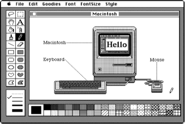
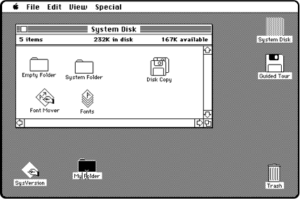
In 1984, the idea of a graphical user interface was a novelty. Building on research from Xerox, and leveraging the all-new computer mouse, Apple’s Macintosh team built a radically new user interface that has charted the course of computer history for the subsequent 30 years. Using basic one-color graphics and leaning on a desktop metaphor with files, folders, and a trashcan, Apple pioneered the idea of windows for different applications and tasks that could be layered on top of one another. With a system font family of calligraphy-inspired typefaces, like Chicago and Geneva, the Mac team’s Susan Kare brought print-like typography and world-class iconography design to the first version of Mac OS.
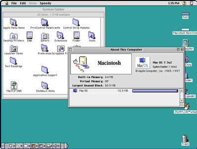
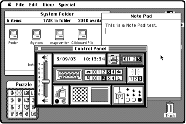
By the 1990s, the Macintosh had seen dozens of iterations and a series of technological enhancements. Even with more capable displays, boasting higher resolutions and all-new colors, Macs continued to leverage the same desktop metaphor and layered windows that had made the original Macintosh so accessible. Some modernizations included Apple’s switching out the original Mac’s system font, Chicago, for the higher-resolution Charcoal, and its addition of the extensions toolbar in the corner of the desktop.
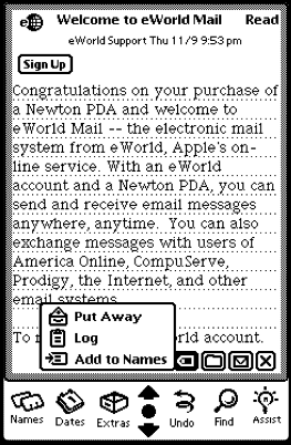
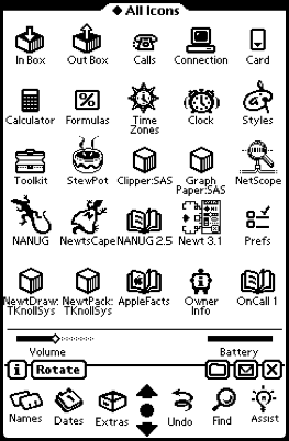
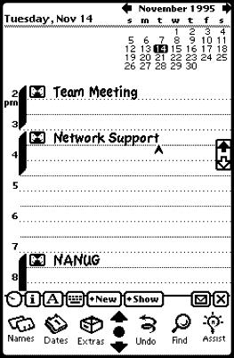
Among Apple’s few historical missteps was the Newton MessagePad, a PDA-like device that featured state-of-the-art handwriting recognition and a portable-specific Newton operating system. The device leaned on a stylus for input, which eventually doomed its lifespan when Steve Jobs returned to Apple. However, many of the company’s learnings from its first failed portable product would come in handy years later, as future products came to revolutionize what we put in our pockets—and how we interact with them.
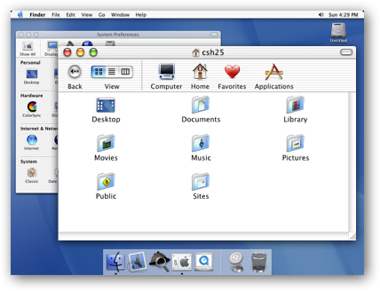
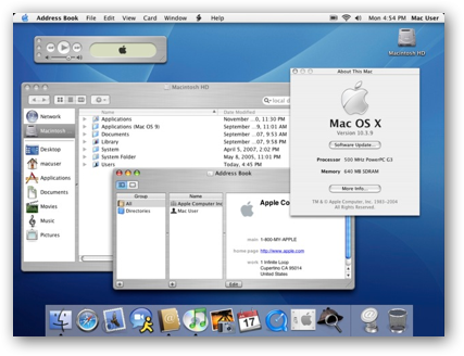
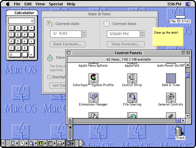
OS X leapt forward into the 21st century, and completely reinvented how Mac OS worked and looked. When Apple acquired Steve Job’s innovative new company NeXT, and reinstated Jobs as “interim” CEO, the course of Mac OS was altered to incorporate NeXTSTEP’s innovations. The new visual design was called Aqua, and featured glossy, liquid-like buttons, translucent menus, and bright blue scrollbars. OS X changed out Charcoal for Lucida Grande and added the Dock, a tray of common applications and running tasks that would become the focal point for user interaction.
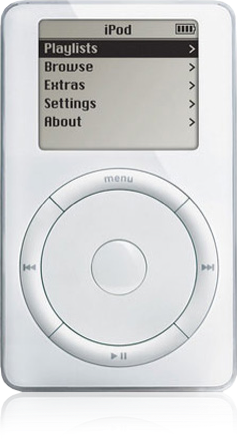
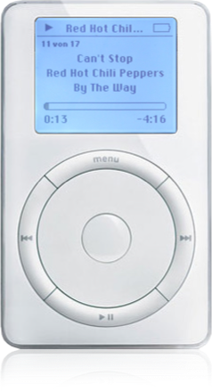
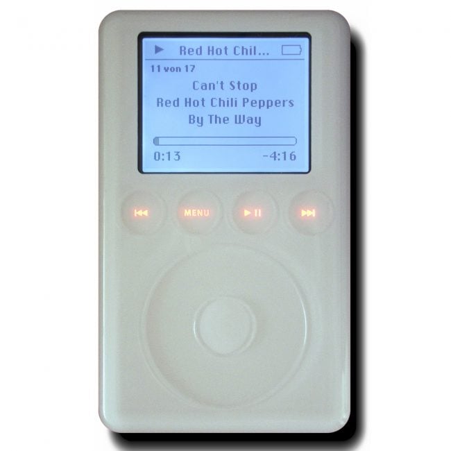
In 2001, Apple introduced the first iPod, a portable hard drive product that enabled music playback of up to 5,000 songs. Using an all-new scroll wheel for user input—later replaced by the simplified ClickWheel—the iPod was Apple’s first smash-hit mobile product that solidified the company’s user interface prowess for millions. iPod arranged artists and options into scrollable lists of text items, set nostalgically in the Mac’s original Chicago typeface (eventually swapped out for the custom Podium Sans), and used nested lists within lists to account for albums and individual songs. A monolithic Menu button above the scroll wheel allowed users to jump back to the previous menu, and served as a single-purpose escape hatch across the system.
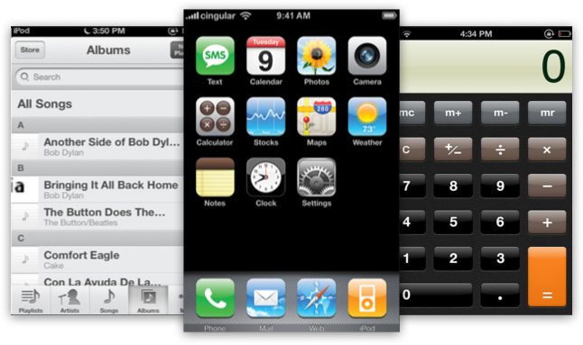
Unlike the stylus-reliant Newton, the iPhone was designed around a large and high-resolution touchscreen display. Featuring an all-new user interface built upon an OS X underpinning, iPhone OS (later renamed iOS) included Aqua-like glossy buttons and buttery scrolling for iPod-like lists. A basic grid of squarish icons served as the springboard into the device’s handful of installed apps, and a solitary home button followed in the Menu button’s footsteps as the escape hatch back to the home screen. It was the culmination of Apple’s many user interface learnings, and the long-term investment in research and testing paid off.
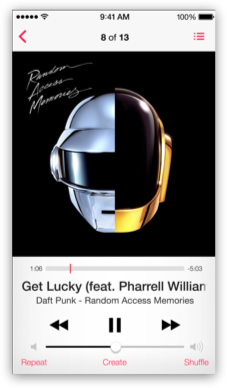
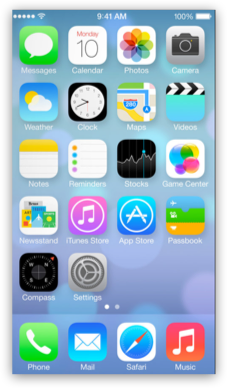
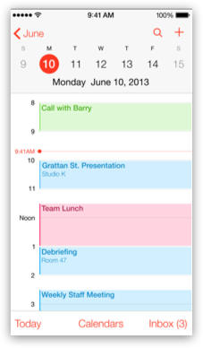
As iOS matured, Apple’s design aesthetic trended toward “skeuomorphic” physical analogues and realism. The trend was exemplified by the Calendar app’s virtual leather title bar and the Game Center app’s faux felt backgrounds. iOS 7 represented a radical redesign of every corner of the operating system, replacing gloss and textures with pure white. System fonts were replaced with an ultralight variant of Helvetica Neue, and the OS implied layering and depth with varying degrees of translucency. App icons were redesigned in line with a prescribed wireframe, which encouraged flatness and obviousness over depth and texture.
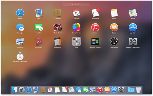
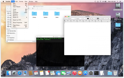
In line with its mobile platform, Apple set out to redesign and re-imagine its oldest operating system with OS X version 10.10, named Yosemite. With OS-wide redesigns and a new system for translucency called vibrancy, Yosemite finalizes Apple’s decade-long stutter-step modifications to Aqua and modernizes the platform once and for all. Lucida Grande was replaced with Helvetica Neue to match iOS, the Dock returned to two dimensionality, and a tighter arc made the longstanding Finder icon a little happier.
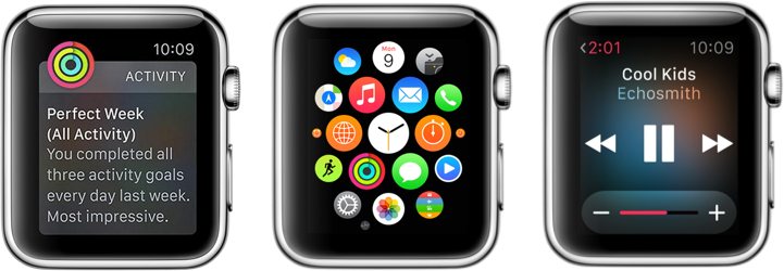
Apple Watch runs watchOS, an all-new wearable operating system that adopts design cues from Ive’s newest trends and repurposes them for a two-inch screen. watchOS saw the debut of San Francisco, Apple’s custom designed typeface, which is optimized for legibility and small point sizes. Apple Watch’s Digital Crown allows users to pan and zoom through maps, lists, and menus, and a web of circular icons make up the device’s home screen. Much like the Menu button or Home button, pressing the Digital Crown returns users to this home screen. watchOS is a brand-new platform from Apple, but represents an evolution and repurposing of its decades-long user interface history.
apple.com | gizmodo.com | wikipedia.com | aresluna.org | toastytech.com | betaarchive.com | mac4ever.com | techrun.in | cultofmac.com | tekku.ru | mac-history.net | thinkios.com | ios7updates.com | arstechnica.com