- 2 Min Read / Blog / 3.2.2020


It would be easy to dismiss 3D Touch on the new iPhone 6s as another gimmick when demoing Apple’s flagship smartphone. Like Flyover in Maps or the Compass app, 3D Touch could be something that users play with once and ultimately ignore forever.
But like iOS 9, iPhone 6s is laying the foundation for what’s to come. Apple is introducing all-new interface paradigms with 3D Touch that will dramatically impact how we use future iPhones and how the apps that run on them are designed.
3D Touch gives designers and developers new opportunities to simplify their interfaces while surfacing enhanced functionality to their users. For iPhone users, these new features essentially offer two phones in one, two ways to interact with content at two distinct levels of depth. And for developers, there’s never been a richer playground through which they can experiment with their most inventive UX ideas.
Mobile has always been designed around making content immediate and available. But in the age of glances and wearables, the amount of time and effort users expect to reach their content is shrinking, fast. Why spend a few minutes poking around through an application when only a few functions or metrics are relevant? Why not make the most frequent actions the most accessible?
This concern is what inspired the Notification Center widgets in iOS 8 and many of the proactive search features launching with iOS 9, but 3D Touch takes immediacy and instant interactivity to new levels as a foundational part of how users interact with apps on iPhone 6s.
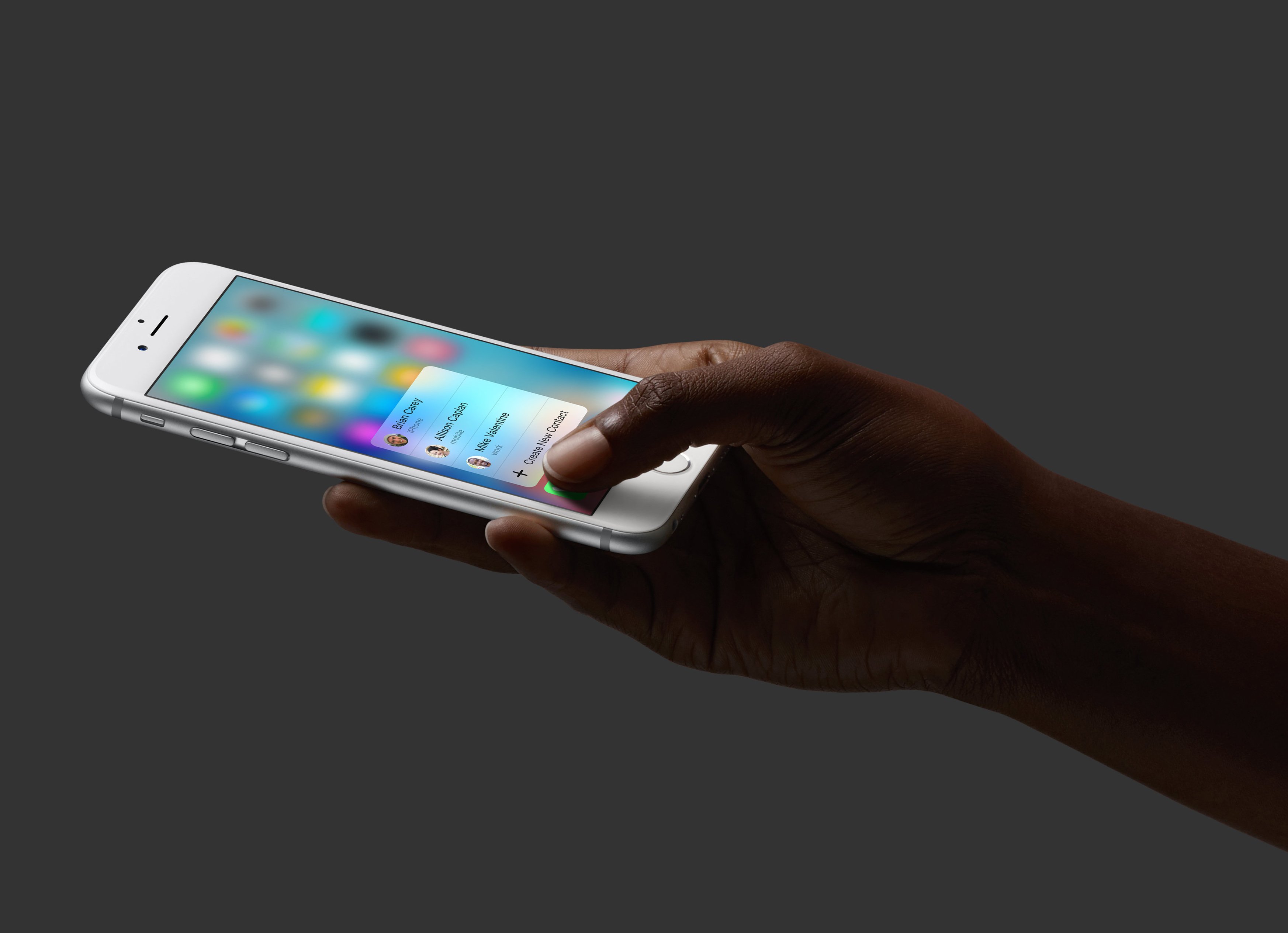
One of the first instances where 3D Touch provides new value is on the iPhone 6s home screen. Pressing firmly on an app icon presents a short list of Quick Actions—jump right into taking a selfie from the Camera icon or immediately navigate your favorite contacts from the Phone app.
The iOS home screen isn’t just a grid of apps anymore.
Developers have an opportunity to surface Quick Actions from within their apps directly on the home screen, as well. In most third-party examples that Apple demoed at its September event, apps like Instagram used Quick Actions to surface items normally found in their apps’ task bars.
But replicating an app’s architecture to this new 3D Touch menu isn’t the only option for providing immediate actions. Considering the one or two core interactions that nearly every user relies on and expects from your app can help inform feature decisions to include in several contexts, including Watch apps and now, Quick Actions. But these are only the beginning of where 3D Touch can accelerate common tasks.
Perhaps the most common, and excessively demoed, functions of the 3D Touch sensor is a new interface gesture Apple calls “peek.” When users press firmly into a piece of content—like a mail message in a list or an image thumbnail in a grid—3D Touch opens a light-box–style preview of what that content contains. Press harder, and the content “pops” into view and takes over the active screen.
Snap and Crackle are conspicuously absent.
Users can peek into an email message and determine if they want to respond, briefly preview an image in Instagram to get more detail than a thumbnail, and more with a simple press of their finger. Similar to a hover state or a tooltip in traditional computer parlance, peeks can be a great way to surface quick information and provide context, without needing to drill down into another view.
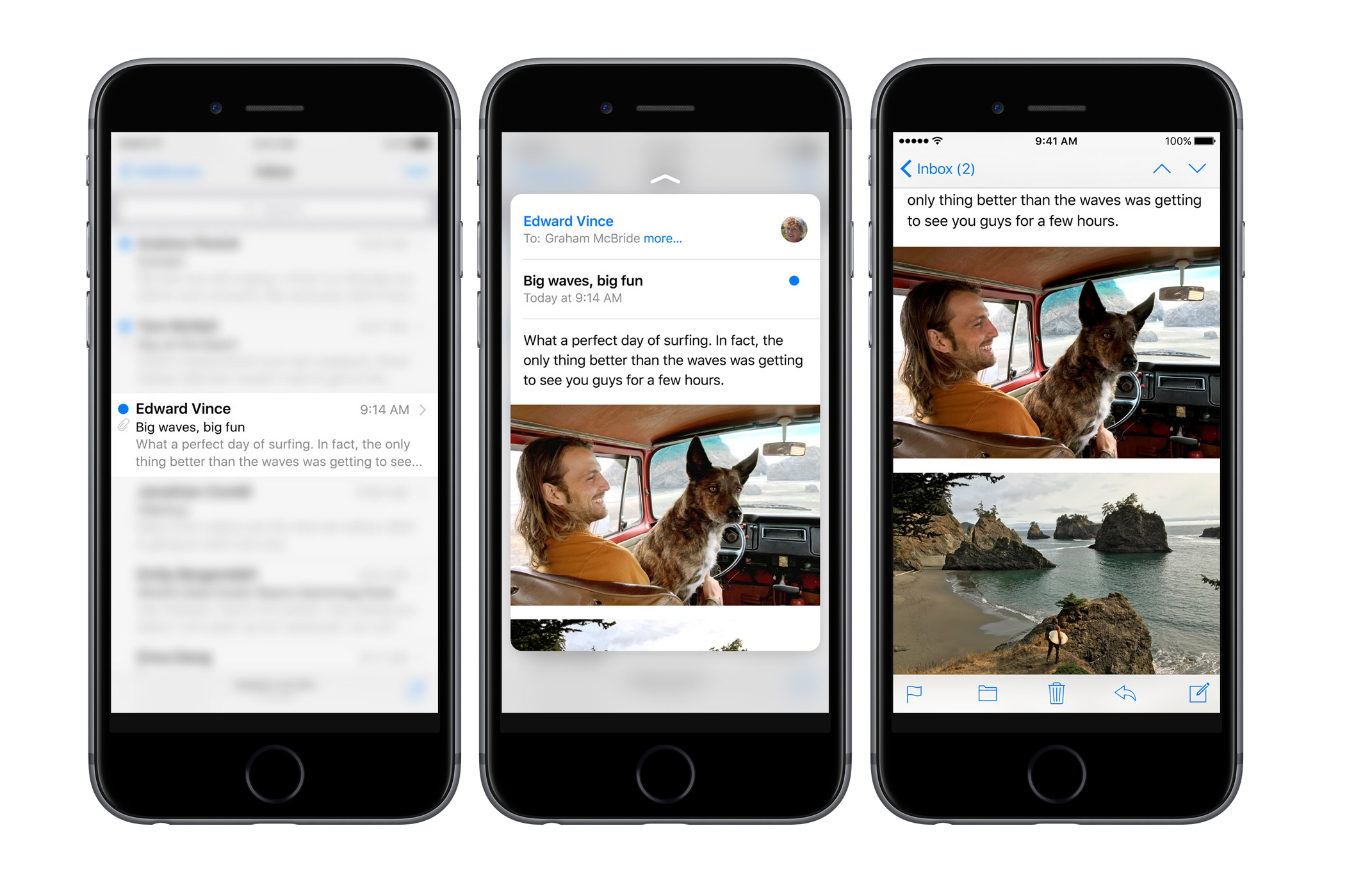
Peek is an opportunity to simplify content architecture paradigms that are as old as iOS, but it could add a layer of complication if not applied smartly. In many of Apple’s system apps, peek is used as a shortcut to the logical last step of common workflows, without the commitment of jumping into another view and potentially losing context.1
But the value of peek doesn’t stop at previewing messages without opening them (and thus triggering “read” indicators in iMessage conversations, for example). Within peek, users can quickly swipe to access common actions, manipulating the virtual content card in a number of ways.
Peek is an entirely new interaction model geared toward power users.
In Mail, swipe left to delete a message and right to mark it as unread. In Messages, swipe up on a peek preview of a webpage to add it to your Safari Reading List. Peek becomes even more interesting when viewed as a layer of interactivity built on top of existing UI elements, unlocking all-new interaction models.
Developers have an opportunity to rethink how the content in their apps is structured, allowing users to quickly access shortcuts that interact with the content on the fly using 3D Touch. Peek works best in applications that users access regularly for repeatable tasks, like checking messages or viewing locations on a map. But even in applications that have different experiences every time, 3D Touch can be a powerful way to simplify the interface while providing even more value to power users.
3D Touch represents a new way of thinking about interface design, plain and simple. Content within applications is malleable and interactive on multiple levels of hierarchy. Just as multi-touch was a phase change in software development, allowing users to pinch and scrub and zoom with unparalleled ease, 3D Touch will unlock interfaces and interaction models we haven’t even dreamt of yet. Just press firmly.