

- 2 Min Read / Blog / 3.2.2020


Accessibility is a topic that in many ways is as old as the web. Because designers and developers have been focused on making digital products accessible for decades, there are many guidelines, standards, and even automated assessment tools that already exist to ensure websites are accessible. There are also regulations that many companies need to comply with, including the Americans with Disabilities Act, which has been updated to include digital product guidelines.
In the technology landscape of 2017, guidelines designed for the web as it was in 1997 are beginning to look dated.
But in the technology environment of 2017, guidelines based around the needs of disabled web users in 1997 are looking increasingly dated. These accessibility guidelines and frameworks were developed in the early days of the web, and in many ways the evolution of consumer technology has outpaced them. Many accessibility guidelines and best practices are focused on the web as it was in 1997—static pages of content.
Designers should endeavor to define accessibility guidelines for the web and mobile as they are in 2017—populated with advanced web and native applications that have their own accessibility best practices. This is based around a commitment to user-centered design, with an understanding that every user is valuable—regardless of their age, familiarity with technology, or disability.
Alienating users—any users—is bad design. Everyone should be able to use any digital product, regardless of disability.
Product designers can’t claim to fully embrace user-centric design unless they design for the needs of every user. Below are a few target areas that expand upon the common guidelines for fonts, colors, and web markup to better address the technologies and use cases of modern users.
There are many paradigms and best practices for how mobile and web experiences to offer fluid into navigation. On mobile devices, standards put forth by Apple and Google help ensure that navigation is consistent between apps and predictable for new experiences. In many cases, simply complying with Apple’s Human Interface Guidelines or Google’s Material Design best practices can ensure an accessible experience of the box. However, there are some common themes that can help any kind of application or user experience prevent alienating the users who depend upon them.
For navigation, it’s essential that the app’s many feature areas are as accessible as possible. In most cases, this needs making them visible the moment the user opens the app, potentially in a tab bar at the bottom of the screen. Google’s Material Design best practices even recently adopted the bottom tab bar as a recommended navigation option, shifting away from its previous stance of hamburger menus.
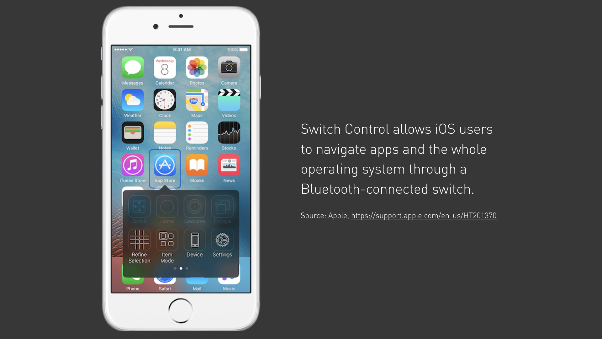
Hamburger menus obscure navigation options behind an invisible drawer—an issue that’s compounded when disabled users are navigating the app through a means other than their fingertip.
About hamburger menus. The three horizontal lines at the top left corner of many interfaces—while prevalent on both web and mobile—are doubly inaccessible in many cases. They not only obscure the navigation items available to the user behind a drawer, but they also place an essential piece of the app’s navigability at the furthest corner of the screen from users’ thumbs. This issue is compounded when users might be interacting with the screen with something other than their fingertip, like switch control or screen reading technologies, as this approach requires two distinct interactions to reach the most essential parts of the app.
Considering the unique needs of mobile users with disabilities can have a halo effect that improves the user experience for all users, even those without such disabilities. Here it is the underlying lesson of accessible design: good UX design, especially in the context of navigation, offers benefits for all users by making the app easier to understand and simpler to use.
Accessible design delivers benefits for all users—disabled or not—by making the app easier to understand and simpler to use.
There are many areas of accessible design that need to be reevaluated for the unique needs and considerations of modern mobile users. However, whether for compliance with federal regulations or for the betterment of all audience members, employing accessible design in mobile app design and development is a surefire way to make your app more usable and more fundamental to your users’ lives.
Register for our webinar on accessibility below!

