- 2 Min Read / Blog / 3.2.2020


Today’s cars have an incredible array of safety technology, ranging from automatic collision detection to the ability just drive themselves outright, but one area in which nearly the entire car market is lagging is the usability of their ridiculously terrible digital console screens. So bad are these user interfaces, that most drivers—and certainly our Uber and Lyft drivers—choose to stick their smartphones right to their windshields for purposes of navigation and controlling music rather than relying on anything the car might have built-in.
Luckily, most automobile manufacturers are leaning into Apple’s CarPlay and Android Auto to integrate with drivers’ existing smartphone operating systems. This has opened up a whole world of user interface design: designing for drivers behind the wheel whose secondary focus your application. Here are a few tips on designing for Apple CarPlay.
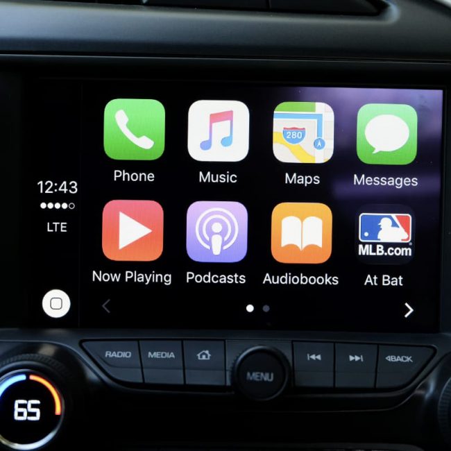
Apple CarPlay—released in 2014—has slowly gained huge market share. Applications like Apple Maps and (as of iOS 12, Google Maps) can now run natively in many vehicles’ dashboards. Other leading contenders for best CarPlay uses are Waze, Spotify, Pandora, various podcasting and audiobooks apps, and iOS’ Siri, which can help drivers hear and dictate texts without looking at their phones.
“The best apps are designed for brief interaction and never command the driver’s attention.”
Create a UX that feels familiar. The car and its CarPlay dashboard are merely extensions of the driver’s iPhone, and your app design should be functionally similar to how it works on the device directly.
Pare down options. You don’t want to overwhelm your driver with buttons and menu options. One might say you should take the exact opposite approach that most automobile manufacturers make themselves. Focus on simplicity. What are a driving users’ most basic interface needs, and how can you most directly meet them?
Ensure safety. This should go without saying, but your app should never be your driver’s primary focus. The road is. Your app exists in a secondary space that is making the driver’s primary task more enjoyable. Don’t distract. Instead, focus on simplicity.
Integrate with Siri. Siri—now in iOS 12 more than ever—is your friend, and any way in which you can build Siri’s voice-activated capabilities into your app will be a blessing for your driver, whose hands should be occupied on the wheel.
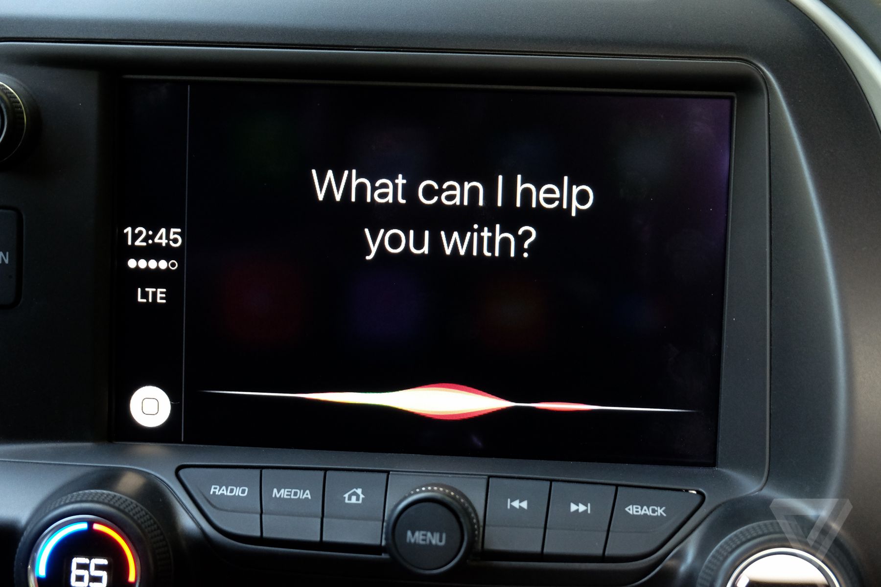
Integrate Siri into Apple CarPlay-compatible apps. | Source: TheVerge.com
Don’t design an app that is overly visually focused. We want your driver’s eyes on the road, not on their console. This is one of the main reasons why designing within the Apple CarPlay framework is as restrictive as it is. The idea, of course, is that a car’s console is no place to have confusing user interface elements.
Don’t design an app that requires much user interaction. Because your user is a driver, and the fact that they are driving is important, Apple’s CarPlay framework severely limits your ability to create unique interfaces that might distract a driver if they need to figure out how to do something on your app. It can be a tough pill to swallow, but designing for Apple CarPlay is one of those instances where you’re not competing for user attention, but rather passive user enjoyment.
Here are a few of our go-to resources from Apple’s Human Interface Guidelines for Apple CarPlay:
If you need help making an Apple CarPlay or Android Auto-compatible version of your app, get in touch.