

- 2 Min Read / Blog / 3.2.2020


In a mobile-first, digital world, everyone uses their phones and computers to accomplish… well, most everything. Whether you’re a user experience designer, product owner, business owner, marketer—or really anyone with some responsibility for a digital product—it’s important that what you create be accessible by all of your users. Designing for UX accessibility means creating products that are able to be used by everyone.
And developing just to meet legal requirements isn’t a good enough reason to be designing for accessibility. In an ideal world, we view those requirements as minimums for universal usability.
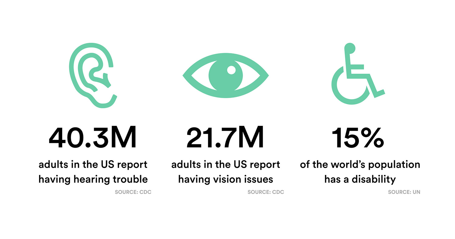
No product owner would intentionally leave out or otherwise alienate 15% of their potential audience, but that’s what we risk doing when we don’t take accessibility web design and app design into consideration. Designing for accessibility improves your user experience not only for disabled users, but for everyone. At Punchkick, we believe that designing for accessibility is paramount to a universally pleasant user experience. Here’s how we do accessible website and app design and why.
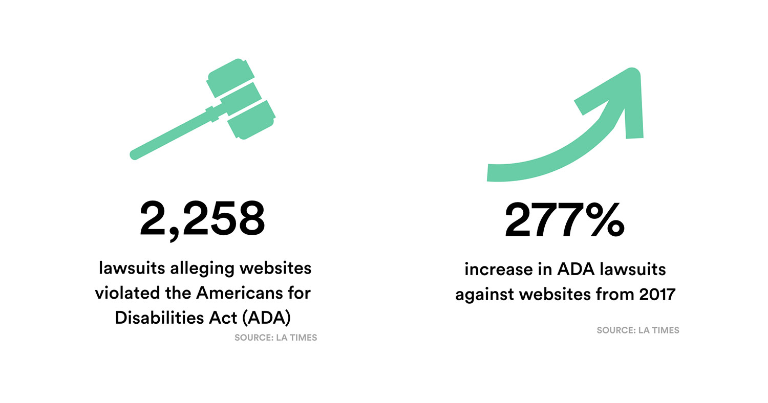
The accessibility movement has been gaining steam for some time, and rightfully so. The A11y Project does great work in attempting to make accessible design easier to understand. Furthermore, major class action lawsuits over accessibility design are on the rise.
 Originally, ADA guidelines were created for a World Wide Web full of static web pages with static images. We’ve now grown far beyond that, and formal guidelines are only recently catching up, which can cause a lot of anxiety for key decision makers behind websites and apps. Will their efforts meet ADA-compliant web design standards? Meanwhile, countless companies continue building products without consideration for UX accessibility and later find themselves in the difficult spot of needing to update their products for compliance.
We should all be proactively designing for accessibility. Making something unavailable, unusable, or difficult to use to a huge portion of your potential audience is deeply alienating. And the percentage of your user base that likely has some type of disability only increases as users age. Of the US population over 80, for example, 72% report having some type of disability. As our generation of digital natives ages, accessibility will only become increasingly important.
Alienating users—any users—is bad design. Everyone should be able to use any digital product, regardless of disabled status or other factors.
Designing to meet the needs of disabled audiences does not make the experience worse for the nondisabled user. The opposite is true. It gets better for everyone (Schmutz, et al). Sites designed for high levels of accessibility rate better for things like time to complete a task and have higher perceived aesthetics. Website users also say that accessible sites feel more trustworthy.
This is where the Web Content Accessibility Guidelines (WCAG) come into play. Created by W3C, the international World Wide Web Consortium, WCAG is simply a range of recommendations meant to make the web more accessible and user-friendly to all.
“People with disabilities are the largest minority group in America, and anyone can become a member at any time.”
—Disability Funders Network
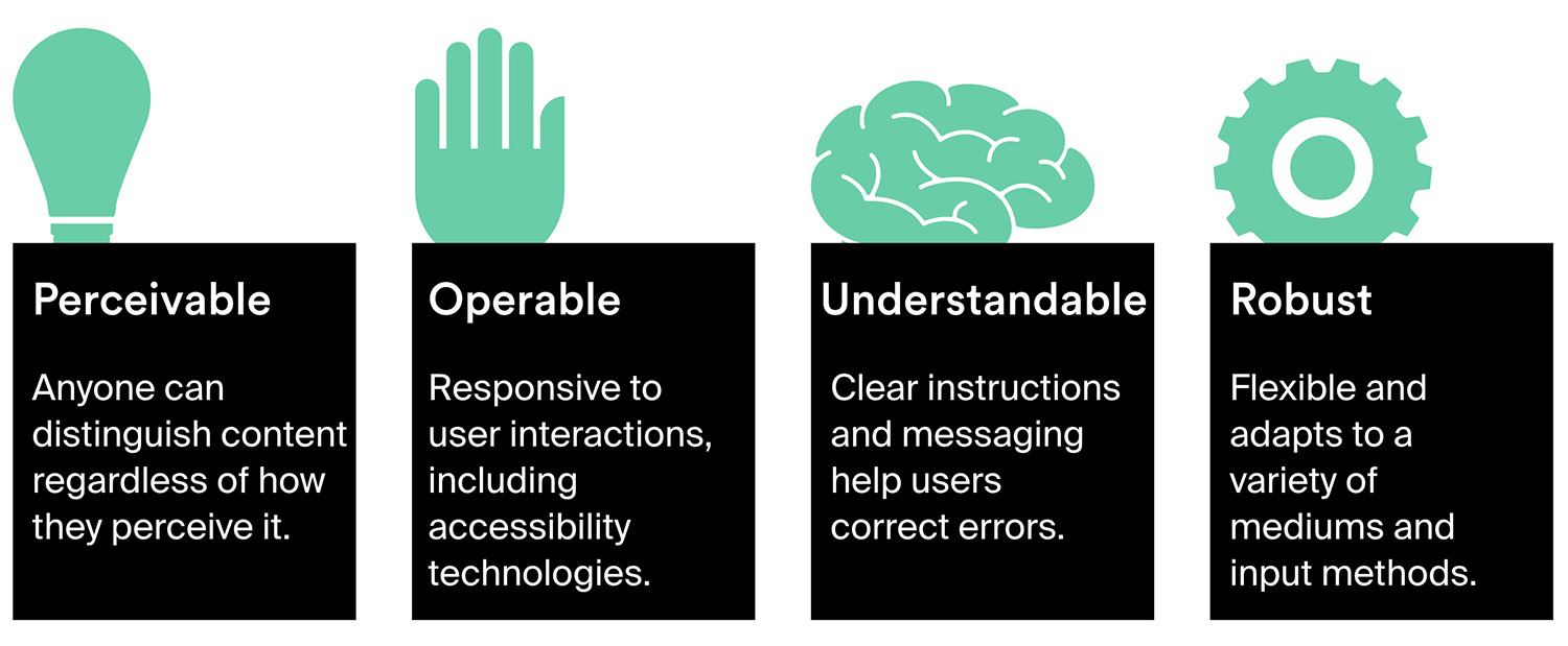
If you’re just getting started with WCAG (Web Content Accessibility Guidelines), there are four core elements to consider in your accessibility web development process:
It’s important to distinguish between user experience and user interface design when developing for accessibility. User interface design describes a tool to facilitate interaction. It’s the means of communication between the user and the system.
User experience design is concerned with making a product more efficient and usable—the user interface is a component of the user experience.
We discussed that the four core elements for WCAG are that a design is perceivable, operable, understandable, and robust. Here are a few examples of how that looks.
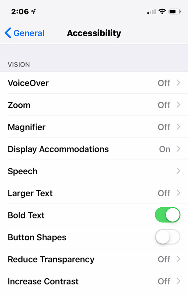
Enabling Bold Text in iOS 12 creates a more visually accessible user experience.
The design should adjust for user-specified perception settings. For example, in the Accessibility settings on iOS, you can choose to enable bold text. Everything functions as expected, except that the text is now bold and more legible for those with vision impairments. But just because an OS offers accessibility settings doesn’t mean your app or website will support them without some legwork and testing on the part of your developers. In short, your UI shouldn’t break just because a user needs to change the text size, for instance.
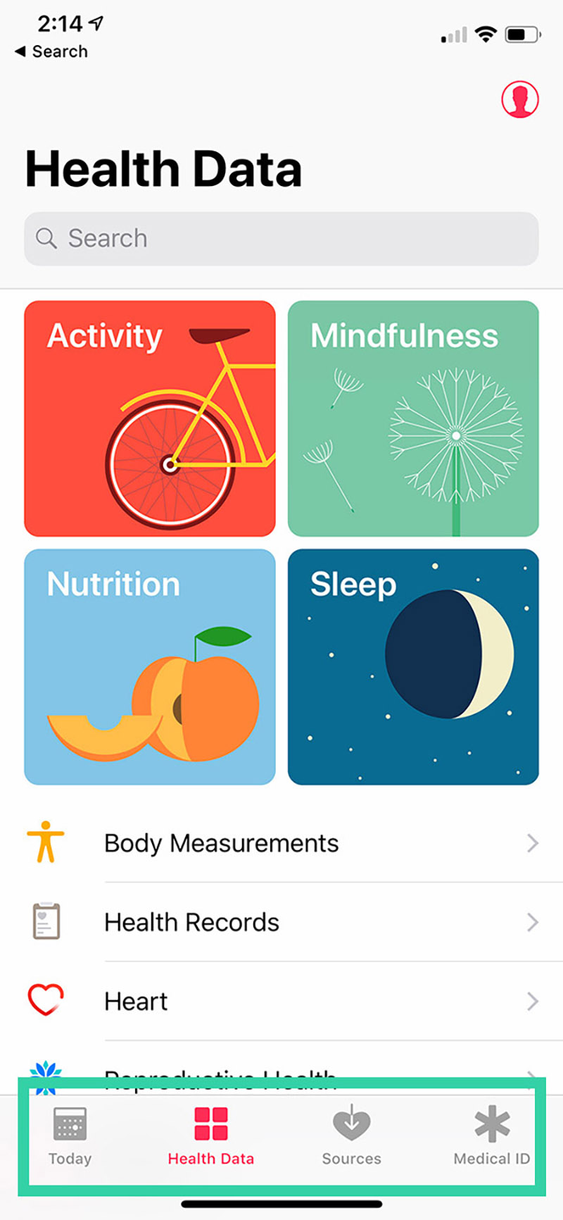
This menu paradigm is more universally accessible because it requires fewer taps to navigate than commonly used collapsible hamburger menus.
A clean user Interface should minimize the number of interactions it takes to accomplish a task. Navigation paradigms on a website, for instance, should be obvious and reduce the number of clicks needed to get to any particular web page.
In mobile apps, touch targets should be large, intuitive, and forgiving. For example, the bottom row of icons in the iOS Health app is more intuitive than the commonly-used hamburger button, which creates friction for the user by hiding available options under an icon. (A fun example: touch targets on words in iOS are larger below the word that they are above because they assume you’re reaching up from the bottom with a finger, and therefore might tap slightly below your actual target.)
A great example of understandability in accessible website design involves the use of forms. Asking someone to fill out a form is a common function across both websites and apps. Errors in forms should be indicated by more than just color. Further, help text, onboarding content, and tooltips should also be accessible.
Gestures and advanced UI functionality should be either secondary or optional. Don’t make an app with a creative, unusual interface that can’t be made to function for everyone.
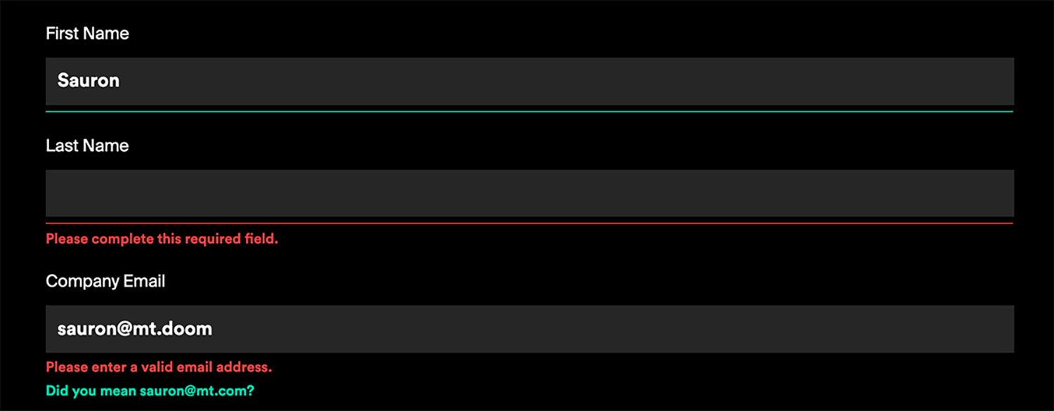
How the form in the footer of our website displays form field errors.
Objects that cursors or fingers can tap should be made to be accessible by keyboards as well. Not everyone has the ability to navigate a mouse effectively, trackpads aren’t all that useful for a lot of users, and many with limited motor abilities in their hands navigate the web through only their keyboard.
Because of this, UI elements should be labeled to support screen readers, including detailed image alt tags. UI elements should be compatible with popular accessibility tools like Switch Control for iOS and Switch Access for Android.
Tools like VoiceOver and Switch Control for iOS and TalkBack and Switch Access for Android are mobile technologies specifically designed for the needs of disabled users.
These will actually read or describe elements of the screen to you, and also allow users with limited mobility to cycle through the elements displayed on the screen and choose which to interact with.
WCAG gets pretty specific on a multitude of best practices in accessible website design. One of the graphic design principles that extends to the web and mobile apps are contrast ratios. Their ideal minimums in contrast ratios for various types of text and calls to action are:
Below is an example of the CTAs on our own website before and after we updated them for WCAG compliance. The WebAIM color contrast checker is a very handy tool to learn about and test these ratios yourself.
Among the most important ways to ensure that your website or app is accessible is to make sure that forms, CTAs, and media are optimized for users with disabilities.
When designing forms, always add field labels that exist outside of the fields themselves. This way, even when a field is populated with content, it’s easy to see which field is which. This is particularly important on longer forms with multiple fields. You’ll see this difference illustrated between Option 1 and Option 2 in the example below.
Form errors are a critical part of a form’s UX. Errors should be augmented with actual words. A user with color blindness, for example, might not see a box highlighted with red, as is the case in Option 2 below. A visual marker where the error is only visible on a hover state isn’t necessarily accessible, either, because it requires using a mouse (Option 3).
For all of these reasons, Option 4 below is the most universally accessible. It also has smoothest user experience for everyone. It may not look as minimally pretty as the first, but it does create the most widely approachable design, whereas the first form potentially alienates a large subset of your audience.
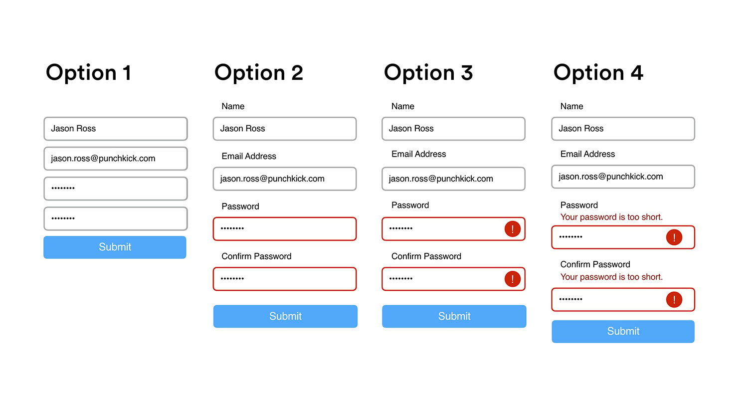
Option 1 may look the most minimally pleasing, but Option 4 provides the most universally accessible experience.
Images and videos should feature alt tags, descriptions, and captions for users with screen readers. Just about every CMS makes this extremely easy to do, although many content producers skip this step when publishing web content. When you upload an image in WordPress, for example, you’re presented with fields for title, alt text, and description. All of them should be filled out for every image used.
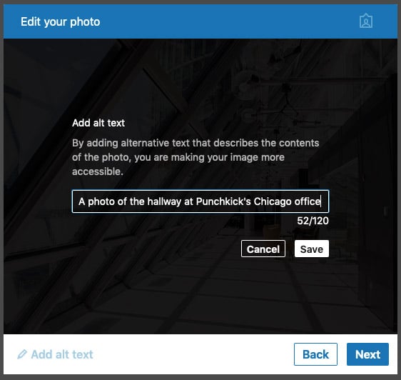
When a user posts an image on LinkedIn, they’re given the option of adding alt text, which makes a more universal LinkedIn experience for those who might be using screen readers.
Some other platforms have taken steps to encourage users to fill out these fields in interesting ways. On LinkedIn, for example, all image posts have a pretty prominent “Add alt text” CTA that allows you to enter alt text for an image, making it more accessible to everyone who might see your post.
With videos, it’s important to always generate captions. While YouTube does have automatic captions, the technology is still pretty rough. We use Rev.com to generate captions for video files for just $1 per minute of video, which is quite reasonable. And as with SEO, a YouTube video with complete metadata that includes captions will rank better than one that’s missing captions.
Accessibility should not be limited merely to legal compliance. Accessibility should be about catering to all users. Accessible design is really just inclusive design. A specific example of accessible functionality that has become universally enjoyable is voicemail transcription. Voicemail transcription is a beautiful universal design because it benefits both disabled and nondisabled users.
Designing for accessibility is great, but as we know from user research and the surge of lawsuits around ADA compliance, intentions aren’t enough. There are legal considerations to be sure, but designing for accessibility is also important because it’s the right thing to do. And you only know that your ADA-compliant website design work has been done well after an accessibility design audit. Here are a few ways to get that done.
Automated code scans can draw attention to clear accessibility design violations, like missing alt tags for images or missing field labels. Online assessment tools can also analyze contrast ratios and markup. The A11y Project has a great set of accessibility code scan resources.
An accessibility audit by an expert well-versed in developing accessible websites can help identify accessibility issues. Punchkick has preferred partners that can execute detailed accessibility audits. Get in touch with us to get started.
The best, most comprehensive form of testing will always be usability testing. In-person user testing can uncover usability gaps on any type of product, including how users with disabilities interact with a product. For accessible design, in-person testing where you literally, physically observe and take notes on how users with various disabilities interact with your product is about as thorough as you can get in designing a powerful and universally accessible user experience.
Remember, accessibility web development is not just about legal compliance. Certainly, leveraging the rise in lawsuits over compliance in mobile apps and web sites is a great reason to dedicate resources to improving your digital user experiences, but ultimately we at Punchkick care about this because it’s the right thing to do for your users. A more accessible user experience is a more universal user experience.