- 2 Min Read / Blog / 3.2.2020


The Chicago Auto Show (CAS) is a staple in the automobile industry, for industry professionals and car enthusiasts alike. Having been around for 111 years and grown to include over 1,000 vehicles across over one million square feet inside Chicago’s McCormick Place, CAS is home to several new vehicle announcements, indoor off-road test tracks, and a dizzying array of technological exhibitions. But to be frank, not all of it is impressive.
Cars are products. Increasingly, they are considered to be vehicles of software as much as complicated physical goods. Tesla’s various vehicles are commonly referred to as “an app with wheels,” which is part of why futurist Peter Diamandis calls Tesla Motors the most innovative company today.
Most vehicles are described by their release year and are updated annually, much like an iPhone. Unlike an iPhone, the changes with each release tend to be largely cosmetic, with various incremental new safety features, and almost no attention paid whatsoever to the underlying operating systems that control so much of the user experience of driving a vehicle.
It’s rare for a vehicle’s interior user experience to match it’s beautiful exterior design.
For some reason, the entire concept of a vehicle being expected to provide a good user experience has never really caught on. Tesla fans certainly argue that that’s one of Tesla’s key differentiators, but not many other vehicle manufacturers seem to put much thought at all into user interface design for their vehicles. And I don’t keep using Tesla as an example because I’m a fanboy (I’m not), I use it because Tesla is one of the extreme few vehicle manufacturers consistently praised for their interior user experience. Even Adobe wrote a post titled The Next Level User Experience of Tesla’s Car Dashboard.
Which brings me to my main frustration with the user experience of cars: the terrible state of car console design.
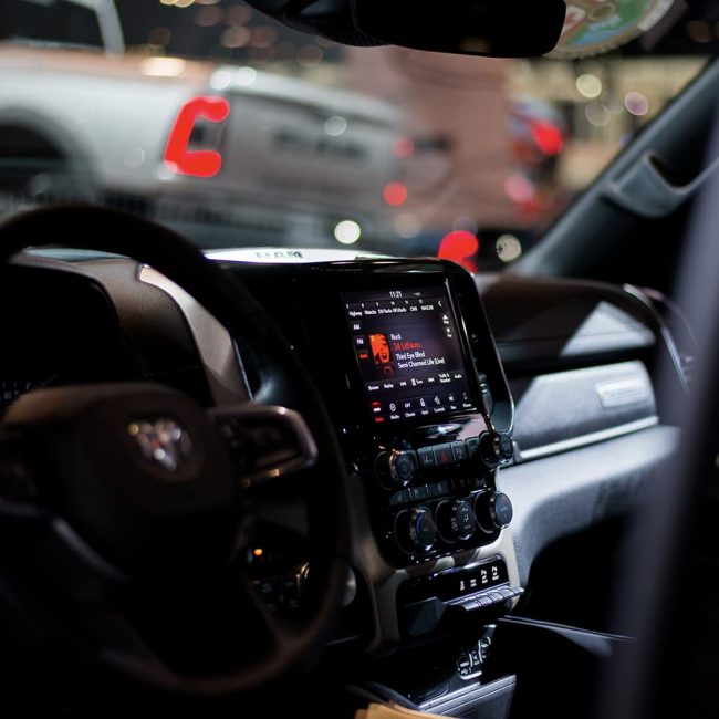
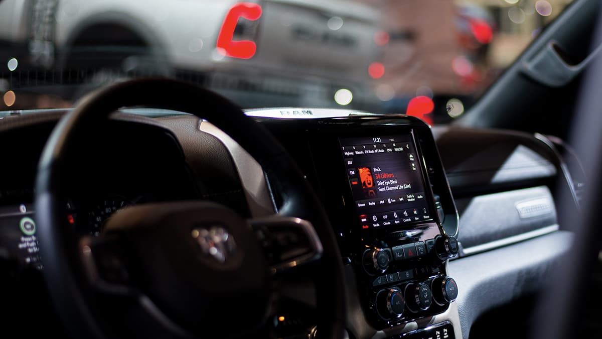
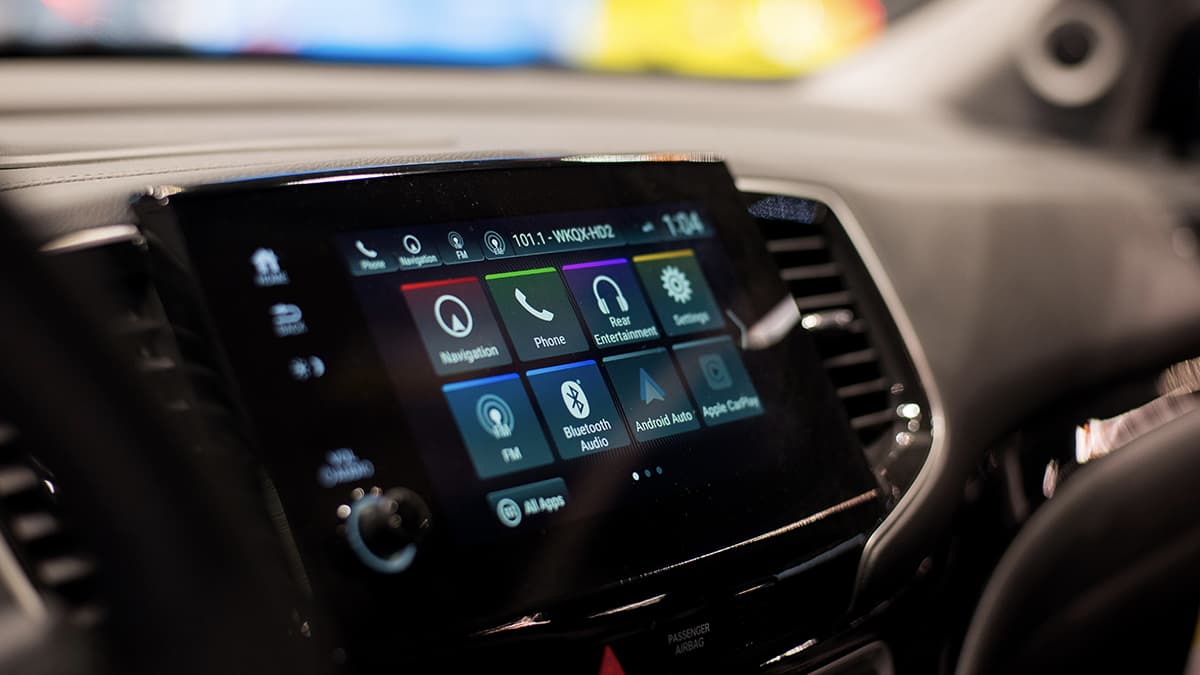
This particular console has some good visualizations going for it under certain circumstances, but is still primarily an amalgamation of disparate sets of buttons, knobs, tabs, and color schemes.
When you’re driving, your center console is your command center. Yes, your dashboard is critically important. But if your car were an iPhone, the console would encompass all of your apps for Maps, Music, Podcasts, HomeKit, Phone, Settings, and more. And yet, these consoles vary wildly from make to make, model to model, and even within various configurations of the same model.
A lot of them look like a factory vomited two or three dozen buttons and knobs across the front of the car with no rhyme or reason as to what went where. To sit in a rental car and try to connect your phone via Bluetooth or even just set the temperature feels like a Sisyphean task. The design of consoles is so poor, just about every button is labeled and backlit. At night, most consoles are a glowing constellation of careless design choices.
It seems to be the case that the more digital real estate and fewer analog buttons, the better a car console looks. But proprietary map systems are lagging behind Google and Apple’s aesthetics.
At CAS, I noticed that the vast majority of vehicles—luxury vehicles in particular—had their consoles turned off at all times. Mind you, these are show floor vehicles that you’re encouraged to get in and out of, to sit in the front seat and put your hands on the wheel. But don’t mess with the center console. Why? My prevailing theory is that it’s widely understood that consoles look so bad and are so distracting that they ruin the flashy image a show floor model is meant to evoke.
And as I learned myself, sitting in the driver’s seat and tinkering around with the console—the first thing a real car buyer would do—was such a turn-off in most instances that I just got back out and lost interest in the vehicle entirely.
I’m going to keep running with my console/iPhone analogy here. From the show floor, I texted my brother—who is actually a car enthusiast, whereas I am not—complaining about how the interior of every car still looked like it was 2005, and even with a decade of touchscreens in cars behind us they were confusing to figure out.
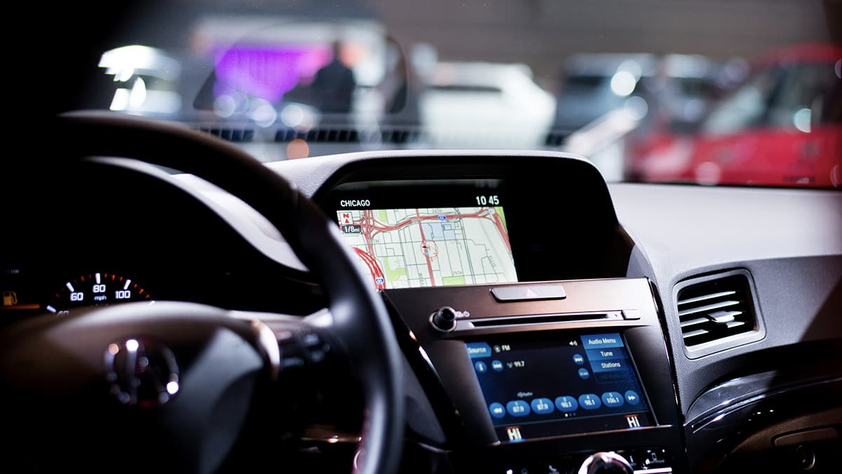
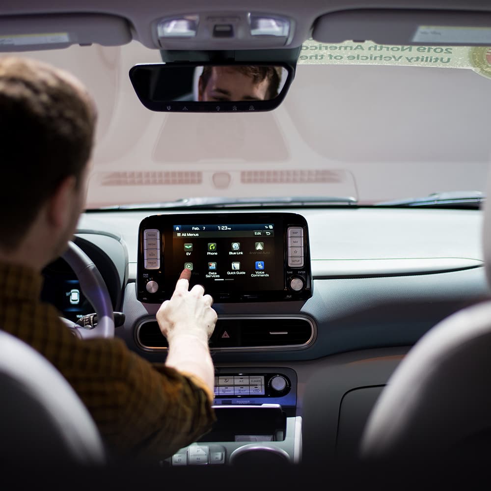
I sat in a 2020 Chevy Bolt, a plug-in electric car meant to be quite competitive in its market, and spent about 10 minutes trying to figure out how to activate Apple CarPlay from my iPhone. I eventually stumbled into an error message telling me that my phone needed to be plugged in via USB for it to work. This is a 2020 model. Wireless CarPlay has been available since 2016.
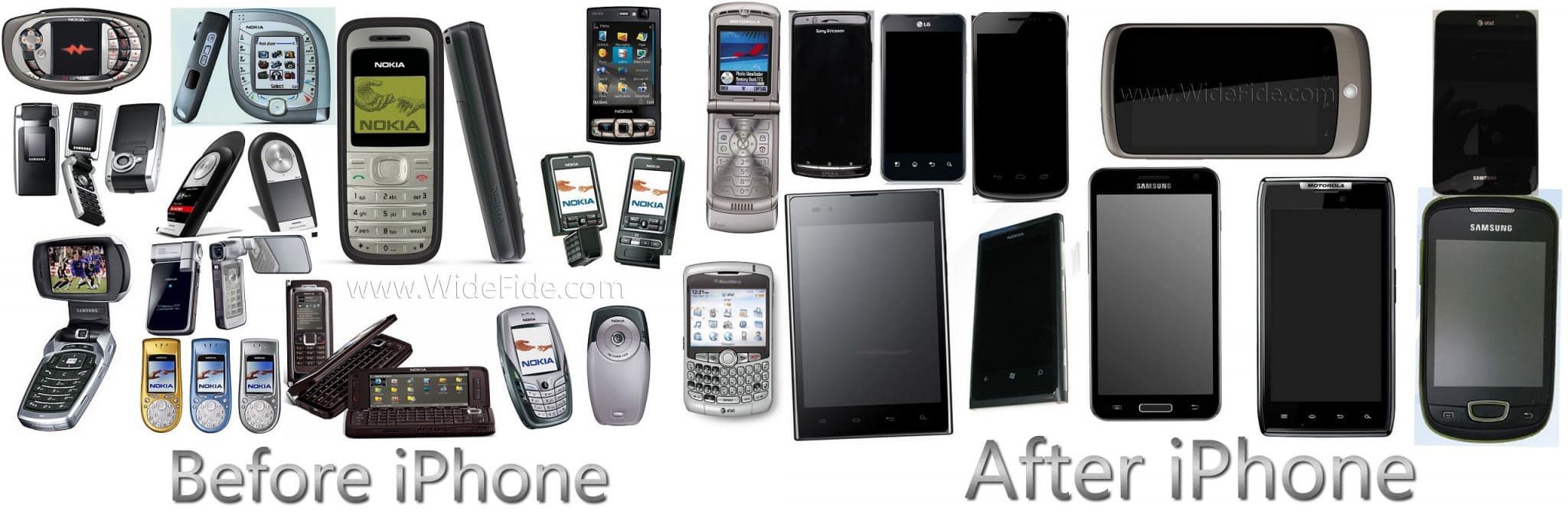
It’s an old meme of an image, but accurately represents where car consoles are now. They’re moving in the right direction, but slowly, and even the assortment of bland digital screens isn’t looking particularly impressive just yet. | Source:WideFide.com
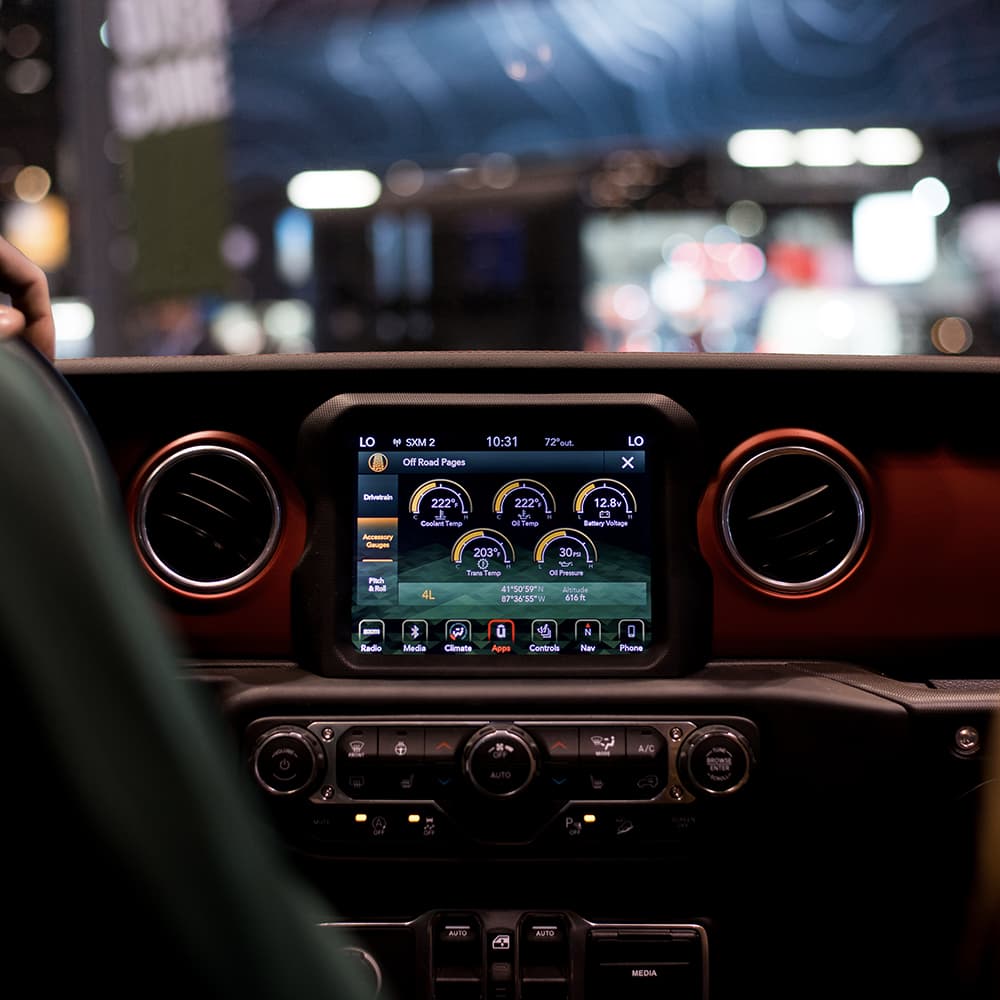
It seems like the only consoles with an even remotely acceptable user experience leverage predominantly large touchscreens. In the world of smartphones and tablets with ever-fewer buttons, this seems like a natural progression in digital UX. And make no mistake, the act of driving a car has become a very digital user experience.
Tactile buttons and knobs of temperature control and volume do serve a valid purpose, of course. A driver can use them easily without taking their eyes off the road. But a smattering of buttons at odd placements in no logical order is a worse distraction than a screen that changes to highlight only what is being sought out by the driver.
Apple CarPlay and Android Auto are wonderful stopgap solutions to the problem of lagging console design. Apple and Google both wanted to capitalize on people increasingly relying on their phones behind the wheel for music, podcasts, navigation, phone calls, and hands-free text messaging, and designing for Apple CarPlay introduces a host of interesting challenges and considerations that car manufacturers seem to ignore themselves.
It serves Apple and Google to bake a portable car console user experience right into your smartphone because it helps keep you within their ecosystem. It also provides you with a more seamless, expanded user experience that extends well beyond the phone in your hand.
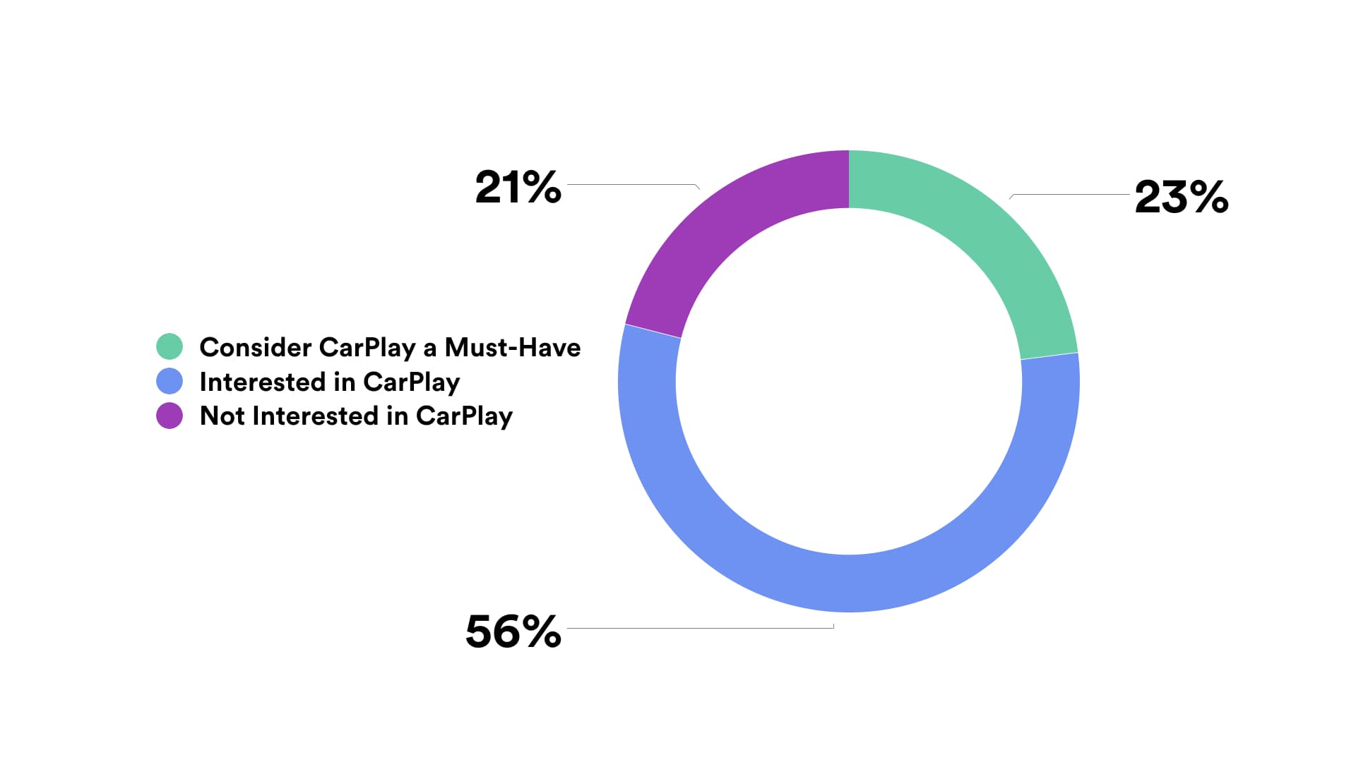
Support for Apple CarPlay and Android Auto increasingly feels like an outright necessity for vehicle manufacturers. A report by Strategy Analytics indicates that 23% of smartphone owners in the US indicate that CarPlay is a “must-have” in their next car. That same study indicated that “34% of CarPlay users use Apple’s system for ‘all’ of their use of media in-car, while 32% use CarPlay for all of their navigation.” For Android Auto, the stats are similarly high: “27% of users rely on Android Auto for media and 33% for [all] navigation.”
Source: TheDrive.com
In my own personal experience, my last car had Apple CarPlay, and I enjoyed it so immensely that you can bet I would never buy another car that wasn’t CarPlay compatible. Touting CarPlay/Auto compatibility is important for car manufacturers, but turning over ownership of your console experience entirely to third-party consumer electronics companies does also feel like a form of giving up. The manufacturers have failed so miserably at interior user experience that an adjacent industry swooped in and wrangled control of it, and now passengers’ driving experience is largely dictated by Apple and Google.
It’s clear that digital is the only way forward with car consoles. With every driver needing easy ways to access climate control, multimedia, an increasing amount of external cameras, and an ever-growing list of other features, buttons and knobs just will not do. Center consoles are generally quite big, but most cars still have only a dainty screen surrounded by a sea of buttons, dials, and wasted space. This has to change.
Console software also needs to be updated; wirelessly, regularly, and for free. This is the modern customer’s expectation. The idea of taking a car into a dealership and having them install a digital update that you have to pay for just to update maps in your car’s navigation system is laughably absurd.
In my mind, this means that car companies need to understand they are also software companies and need to produce and maintain their own interior operating systems. The truth is, the automobile industry has been bleeding into the software world for many years. It’s just that car manufacturers largely fail in this new role. It’s no coincidence that some of the biggest new vehicle reveals have moved away from auto shows like the Chicago and Detroit Auto Shows and into Las Vegas’ Consumer Electronics Show (CES). And they’re competing against software companies like Uber directly now, too. The phrasing of this headline, for example, implies an enormous shift in the industry and consumer expectations: CES is now one of the world’s biggest auto shows as Ford to Uber debut new technology.
This shift into software is why UX is booming in the automotive industry and smart cars bring new UX challenges. Many designers are toying with creating their own console UX concepts. Now it’s time for the manufacturers themselves to catch up to their users’ expectations about what driving in the modern age should feel like.
There’s no going back to elegant simplicity.